In this article, we will explain how to create a Modal box with Javascript.
It can be easily created by using the dialog element.
Table of Contents
- ⓪What the <dialog> element is
- ①Prepare the Components for the Modal box
- ②Open the Modal Box
- ③Close the Modal Box When the Close button is Clicked
- ④Close the Modal Box When the Background is Clicked
- ⑤Prevent Scroll Propagation
- ⑥Change the Background Color
- ⑦Animation When Opening the Modal Box
- The full text of source code
⓪What the <dialog> element is
The <dialog> element was introduced in HTML5. Since it provides the default style of modal box, the CSS code can be significantly reduced (though JavaScript is still required).
It’s also beneficial that it makes elements outside the modal unfocusable when the modal is open.
It appears that the <dialog> element is already supported in major web browsers.
Reference: https://caniuse.com/?search=dialog
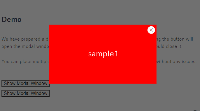
①Prepare the Components for the Modal box
Enclose the content you want to display in the modal box with the <dialog> tag.
Also, let’s prepare buttons to open and close the modal box.
<button class="dialog-open">Open the modal box</button>
<dialog>
<button class="dialog-close cloase-btn">×</button>
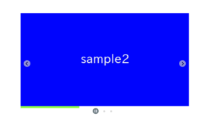
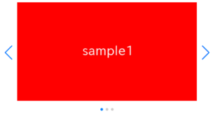
<img src="./img/sample.png">
</dialog>②Open the Modal Box
By executing the showModal() method on the dialog element, the modal box opens.
So, when the triggering button is clicked, retrieve the adjacent dialog element and execute the showModal() method.
document.addEventListener('click', (e, elem = e.target) => {
    elem.classList.contains('dialog-open') && elem.nextElementSibling.showModal()
})
③Close the Modal Box When the Close button is Clicked
By executing the close() method on the dialog element in JavaScript, the modal box closes.
When the close button is clicked, retrieve the parent dialog element and execute the close() method.
document.addEventListener('click', (e, elem = e.target) => {
    elem.classList.contains('dialog-open') && elem.nextElementSibling.showModal()
    elem.classList.contains('dialog-close') && elem.closest('dialog').close()   // added
})
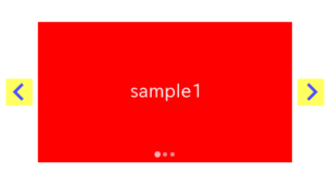
Here is an example of the close button style.
In this case, we position it as an ‘X’ mark in the upper right corner.
dialog .cloase-btn {
    position: absolute;
    cursor: pointer;
    top: 6px;
    right: 6px;
    font-size: 36px;
}
Now the close functionality should be in place, please give it a try.
④Close the Modal Box When the Background is Clicked
Let’s also make it possible to close the modal box by clicking on the background.
Since the closing functionality has been implemented earlier, you just need to add a class to the dialog element.
<!-- <dialog> -->               <!-- removed -->
<dialog class="dialog-close">   <!-- added -->
    <button class="dialog-close cloase-btn">×</button>
    <img src="img/sample.png">
</dialog>
Now, clicking the background should close the modal box.
⑤Prevent Scroll Propagation
When the content is too long to fit within the frame, the dialog element automatically enables scrolling.
However, an issue remains: if you scroll again after finishing scrolling within the modal, the content outside the modal is also scrolled.
To solve this issue, the overscroll-behavior property comes in handy.
dialog {
    overscroll-behavior-y: none;
}
Scrolling should no longer propagate. Please give it a try.
⑥Change the Background Color
The background color can be changed using the ::backdrop pseudo-element.
dialog::backdrop {
    background: #1119;
}⑦Animation When Opening the Modal Box
Let’s add a fade-in animation when opening the modal box.
dialog {
    overscroll-behavior-y: none;
    animation: fadeIn 2s forwards;  /* added */
}

/******** added ********/
@keyframes fadeIn{
    from { opacity: 0 }
    to   { opacity: 1 }
}
The modal box should now be displayed slowly. Please give it a try.
The full text of source code
In the end, we put the full text of source code.
<style>
    dialog {
        overscroll-behavior-y: none;
        animation: fadeIn 2s forwards;
    }
    dialog::backdrop {
        background: #1119;
    }
    dialog .cloase-btn {
        position: absolute;
        cursor: pointer;
        top: 0;
        right: 0;
        font-size: 36px;
    }
    @keyframes fadeIn{
        from { opacity: 0 }
        to   { opacity: 1 }
    }
</style>

<button class="dialog-open">Open the modal box</button>
<dialog class="dialog-close">
    <button class="dialog-close cloase-btn">×</button>
    <img src="./img/sample.png">
</dialog>

<script>
    document.addEventListener('click', (e, elem = e.target) => {
        elem.classList.contains('dialog-open') && elem.nextElementSibling.showModal()
        elem.classList.contains('dialog-close') && elem.closest('dialog').close()
    })
</script>
That is all, it was about how to create a Modal box with Javascript.