In this article, we will explain how to implement multiple accordion menus without using external libraries, and provide demos for reference.
Implementing accordion open-close animations in raw JavaScript can become complex, but we aim to keep the code concise.
Table of Contents
- ⓪Requirements
- ①Prepare the components of the accordion menu in HTML
- ②Implement the open-close functionality in JavaScript.
- ③Refine the appearance with CSS
- ④Add opening and closing animations
- ⑤Allow specifying the initial open/close state on access
- ⑥Change the direction of the arrow when it’s open and closed
- The full text of source code
⓪Requirements
We aim to implement accordions with minimal code, but without compromising on functionality.
We intend to meet the following requirements typically expected from standard accordions.
- Add opening and closing animations
- Allow specifying the initial open/close state on access
- Change the direction of the arrow when it’s open and closed
- Ensure smooth functionality even with multiple instances of the accordion
From this point, we will provide a detailed explanation step by step. However, if you prefer not to have explanations and would like to see the complete source code, you can skip directly to the full source code from here.
①Prepare the components of the accordion menu in HTML
First, prepare the button and content for the accordion menu in HTML.
<div class="accordion-btn">Accordion Button</div>
<div class="accordion-content">
    <p>Accordion Content</p>
</div>
②Implement the open-close functionality in JavaScript.
We use forEach to ensure it works with multiple accordions.
Additionally, we set the necessary styles for the open-close functionality in JavaScript rather than CSS for clarity.
The event registration for opening and closing content on button click is done in line 6.
document.querySelectorAll('.accordion-btn').forEach(function(el){
    const next = el.nextElementSibling
    const nextH = next.scrollHeight + 'px'
    next.style.overflow = 'hidden'
    next.style.height = 0
    el.onclick = () => next.style.height = el.classList.toggle('open') ? nextH : 0)
})However, transitions do not work when changing from height: 0 to height: auto, so CSS alone cannot handle the open-close animations for content with variable heights (as of October 2023).
While you can achieve a somewhat similar effect using CSS with padding or max-height, I personally believe that implementing smooth open-close animations is best done using JavaScript for a cleaner result.
We put demo up to this point. It currently fulfills 1 out of 4 requirements.
- Add opening and closing animations
- Allow specifying the initial open/close state on access
- Change the direction of the arrow when it’s open and closed
- Ensure smooth functionality even with multiple instances of the accordion
Accordion Content
Accordion Content
Accordion Content
③Refine the appearance with CSS
Let’s style the appearance using CSS for clarity.
Note that the padding specified in line 7 should be applied to the elements inside the content, not the content itself, to prevent any visual distortion.
.accordion-btn {
    cursor: pointer;
    background: skyblue;
    padding: 10px;
}
.accordion-content p{
    padding: 10px;
}
④Add opening and closing animations
To add open-close animations, you just need to specify a transition on the accordion content.
document.querySelectorAll('.accordion-btn').forEach(function(el){
    const next = el.nextElementSibling
    const nextH = next.scrollHeight + 'px'
    next.style.overflow = 'hidden'
    next.style.transition = '0.5s' // added
    next.style.height = 0
    el.onclick = () => next.style.height = el.classList.toggle('open') ? nextH : 0
})
We put demo up to this point. It currently fulfills 2 out of 4 requirements.
- Add opening and closing animations
- Allow specifying the initial open/close state on access
- Change the direction of the arrow when it’s open and closed
- Ensure smooth functionality even with multiple instances of the accordion
Accordion Content
Accordion Content
Accordion Content
⑤Allow specifying the initial open/close state on access
There may be cases where you want a specific accordion menu to be open from the start. Let’s make it so that if the accordion button has the “open” class, it will be in the open state.
document.querySelectorAll('.accordion-btn').forEach(function(el){
    const next = el.nextElementSibling
    const nextH = next.scrollHeight + 'px'
    next.style.overflow = 'hidden'
    next.style.transition = '0.5s'
    next.style.height = el.classList.contains("open") ? nextH : 0   // modified
    el.onclick = () => next.style.height = el.classList.toggle('open') ? nextH : 0
})
By adding the “open” class to the accordion button you want to keep open from the start, the content will be displayed in the open state by default.
<div class="accordion-btn open">Accordion Button</div>  <!-- modified -->
<div class="accordion-content">
    <p>Accordion Content</p>
</div>
<div class="accordion-btn">Accordion Button</div>
<div class="accordion-content">
    <p>Accordion Content</p>
</div>
We put demo up to this point. It currently fulfills 3 out of 4 requirements.
- Add opening and closing animations
- Allow specifying the initial open/close state on access
- Change the direction of the arrow when it’s open and closed
- Ensure smooth functionality even with multiple instances of the accordion
Accordion Content
Accordion Content
Accordion Content
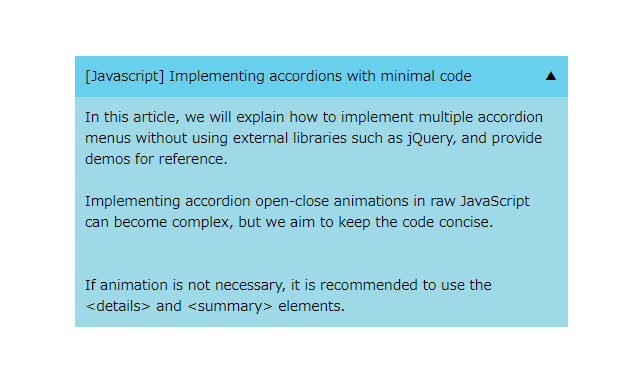
⑥Change the direction of the arrow when it’s open and closed
Typically, accordions have arrows or some visual indicators on the buttons for clarity.
Finally, let’s make sure to display different arrows for when it’s open and when it’s closed.
We will use the CSS ::after pseudo-element to display each arrow on the far right of the accordion button.
.accordion-btn::after{
    content: '▼';
    float: right;
}
.accordion-btn.open::after{
    content: '▲';
}
We put demo up to this point. It now meets all of the specified requirements
- Add opening and closing animations
- Allow specifying the initial open/close state on access
- Change the direction of the arrow when it’s open and closed
- Ensure smooth functionality even with multiple instances of the accordion
Accordion Content
Accordion Content
Accordion Content
The full text of source code
In the end, I put the full text of source code.
<style>
    .accordion-btn {
        cursor: pointer;
        background: skyblue;
        padding: 10px;
    }
    .accordion-content p{
        padding: 10px;
    }
    .accordion-btn::after{
        content: '▼';
        float: right;
    }
    .accordion-btn.open::after{
        content: '▲';
    }
</style>

<div class="accordion-btn">Accordion Button</div>
<div class="accordion-content">
    <p>Accordion Content</p>
</div>

<script>
    document.querySelectorAll('.accordion-btn').forEach(function(el){
        const next = el.nextElementSibling
        const nextH = next.scrollHeight + 'px'
        next.style.overflow = 'hidden'
        next.style.transition = '0.5s'
        next.style.height = el.classList.contains("open") ? nextH : 0
        el.onclick = () => next.style.height = el.classList.toggle('open') ? nextH : 0
    })
</script>
That is all, it was about how to implement accordions with minimal code.
