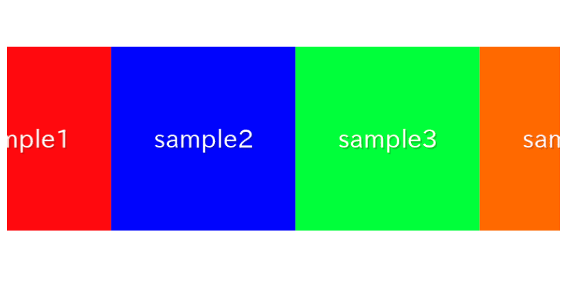
In this article, we are going to describe how to make infinite loop slider which continue to flow automatically using only CSS.
Table of Contents
①Prepare slide elements
Prepare slide elements in HTML.
Don’t forget to prepare two sets of slides as shown below (here, 4 slides per set).
<div class="loop-slide">
    <div>
        <img src="./img/sample1.png">
        <img src="./img/sample2.png">
        <img src="./img/sample3.png">
        <img src="./img/sample4.png">
        <img src="./img/sample1.png">
        <img src="./img/sample2.png">
        <img src="./img/sample3.png">
        <img src="./img/sample4.png">
    </div>
</div>
②Add slide animation
The CSS is sufficient as follows.
Ensure that the min-width property on line 9 is set to calc(100% / THE NUMBER OF SLIDES).
.loop-slide {
    overflow: hidden;
}
.loop-slide > div {
    display: flex;
    animation: slide-to-left 1s linear infinite;
}
.loop-slide > div > * {
    min-width: calc(100% / 4);
}
@keyframes slide-to-left {
    100% { transform: translateX(-100%) }
}
The infinite loop slider has been created.
③Change the slide speed
You can specify the slide speed in the numerical part of the animation property.
It is currently set to 1 second, so let’s change it to 5 seconds.
.loop-slide > div {
    display: flex;
    /* animation: slide-to-left 1s linear infinite; */  /* removed */
    animation: slide-to-left 5s linear infinite;        /* added */
}
The slide speed has been successfully changed.
④Pause the slide on hover
By adding the following CSS, the slide will pause on hover.
.loop-slide > div:hover{
    animation-play-state: paused;
}
We believe it should pause when you hover, so please give it a try.
⑤Reverse the flow
By adding “reverse” to the animation property as shown below, you can make the slides flow in the opposite direction.
.loop-slide > div {
    display: flex;
    /* animation: slide-to-left 5s linear infinite; */      /* removed */
    animation: slide-to-left 5s linear infinite reverse;    /* added */
}
The flow has been reversed.
The full text of source code
We put the full source code up to this point.
※We have also included information about an advanced variation which you can change the number of displayed slides at the very end, so if you’re interested, please take a look.
<style>
    .loop-slide {
        overflow: hidden;
    }
    .loop-slide > div:hover{
        animation-play-state: paused;
    }
    .loop-slide > div {
        display: flex;
        animation: slide-to-left 5s linear infinite reverse;
    }
    .loop-slide > div > * {
        min-width: calc(100% / 4);
    }
    @keyframes slide-to-left {
        100% { transform: translateX(-100%) }
    }
</style>

<div class="loop-slide">
    <div>
        <img src="./img/sample1.png">
        <img src="./img/sample2.png">
        <img src="./img/sample3.png">
        <img src="./img/sample4.png">
        <img src="./img/sample1.png">
        <img src="./img/sample2.png">
        <img src="./img/sample3.png">
        <img src="./img/sample4.png">
    </div>
</div>
Advanced:Change the number of displayed slides
Actually, with the above method, you cannot change the number of displayed slides.
Let’s see what happens when we try to change the number of displayed slides to 2, as shown below.
.loop-slide > div > * {
    /*min-width: calc(100% / 4);*/  /* removed */
    min-width: calc(100% / 2);      /* added */
}
This doesn’t work properly.
If you watch for a while, you’ll notice that the animation resets midway.
It’s resetting after only two slides when we want it to reset after all four have flowed.
To address this, let’s extend the distance the slides move.
Set the argument of the translateX function to calc(-100% * (TOTAL NUMBER / DISPLAYED NUMBER)).
@keyframes slide-to-left {
    100% { transform: translateX(calc(-100% * (4 / 2))) }
}
It’s now working without resetting midway!
However, hardcoding numbers directly into CSS is not developer-friendly, so let’s try using custom properties to pass values from HTML.
.loop-slide > div > * {
    /* min-width: calc(100% / 2); */            /* removed */
    min-width: calc(100% / var(--slideToShow)); /* added */
}
@keyframes slide-to-left {
    /* 100% { transform: translateX(calc(-100% * (4 / 2))) } */                             /* removed */
    100% { transform: translateX(calc(-100% * (var(--slideNum) / var(--slideToShow)))) }    /* added */
}
<!-- <div class="loop-slide"> --> <!-- removed -->
<div class="loop-slide" style="--slideToShow:2; --slideNum:4;"> <!-- added -->
You should be able to confirm that it’s working fine.
Now, you can change the number of displayed slides from the HTML side!
Advanced:The full text of source code
In the end, we put the full source code for the advanced variation.
<style>
    .loop-slide {
        overflow: hidden;
    }
    .loop-slide > div:hover{
        animation-play-state: paused;
    }
    .loop-slide > div {
        display: flex;
        animation: slide-to-left 5s linear infinite reverse;
    }
    .loop-slide > div > * {
        min-width: calc(100% / var(--slideToShow));
    }
    @keyframes slide-to-left {
        100% { transform: translateX(calc(-100% * (var(--slideNum) / var(--slideToShow)))) }
    }
</style>

<div class="loop-slide" style="--slideToShow:2; --slideNum:4;">
    <div>
        <img src="./img/sample1.png">
        <img src="./img/sample2.png">
        <img src="./img/sample3.png">
        <img src="./img/sample4.png">
        <img src="./img/sample1.png">
        <img src="./img/sample2.png">
        <img src="./img/sample3.png">
        <img src="./img/sample4.png">
    </div>
</div>
That is all, it was about how to make infinite loop slider using CSS.


