When developing websites, there will always be opportunities to create a slider.
Swiper.js is one of the recommended libraries to choose in such cases.
It is jQuery-independent, option-rich, highly customizable, and used worldwide.
In this tutorial, We will explain the basic usage, customization methods, and popular sliders of Swiper.js!
Table of Contents
Features of Swiper.js
Swiper.js features include the following.
- No jQuery required
- Lots of options
- Easily responsive
- Easy to add animation effects
- High development frequency
- Supports React and Vue
In the current trend of ‘moving away from jQuery,’ Swiper.js, which does not require jQuery, is truly appreciated. As the movement away from libraries that rely on jQuery gains momentum, Swiper is reassurance.
Also, Swiper.js is rich in options, and we counted 117 options in the latest version, ver11.
Of course, you don’t need to memorize all of them, but it is nice to have a lot of options because it makes it easier to achieve what you want to create.
For example, Swiper.js has the breakpointes option which makes it easy to create a responsive slider, or the effect option which makes it easy to add animation effects.
Also, Swiper.js seems to be under active development. When I first used it in September 2022, the latest version was ver8, but in a little over a year, it has been released up to ver11 (as of December 2023).
We are glad to see that development is active, as it means that bugs are fixed and new functions are added to the library, which is great for the users.
A Disadvantage of Swiper.js
The only disadvantage of Swiper.js is unfortunately its large file size.
We have included a comparison table with other slider libraries.
| Library | Version | File Size |
|---|---|---|
| Swiper | 11 | 146KB |
| Slick | 1.9.0 | 43KB |
| Splide | 4.1.4 | 30KB |
| Glide | 3.6.0 | 27KB |
Large file sizes take a long time to load and slow down the display speed of your website.
However, the method described below article can cover this weakness by reducing the loading cost of Swiper.js to zero.
[Swiper] Reducing the loading cost of Swiper.js to zero
After learning basic usage of Swiper.js, if you are concerned about display speed, please give it a try.
Getting Started with Swiper.js
To use Swiper, there are three methods available, but starting with the CDN is the easiest.
・Use CDN
・Download the source
・Install via npm
For CDN usage, simply add the following two lines to your HTML file, and you’re ready to use Swiper.
<link rel="stylesheet" href="https://cdn.jsdelivr.net/npm/swiper@8/swiper-bundle.min.css">
<script src="https://cdn.jsdelivr.net/npm/swiper@8/swiper-bundle.min.js"></script>Although ver11 has addressed some issues, there are still some minor bugs so we recommend to use ver8 for a more stable experience.
Basic Usage of Swiper
Let’s now take a look at the basic usage of Swiper.
Make sure not to forget the ‘Getting Started with Swiper.js‘ as explained above.
We’ll proceed by breaking it down into HTML, CSS, and JavaScript for clarity.
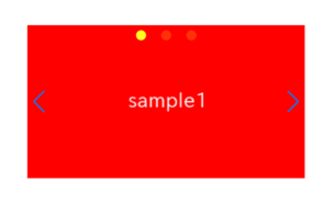
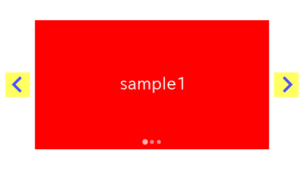
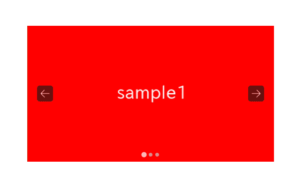
Prepare the Parts in HTML
Here, the content of the slides is set as images.
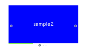
If navigation(arrows) or pagination(dots) are needed in Swiper slider, you must include the HTML tags in your code.
<div class="swiper sample-slider">
<div class="swiper-wrapper">
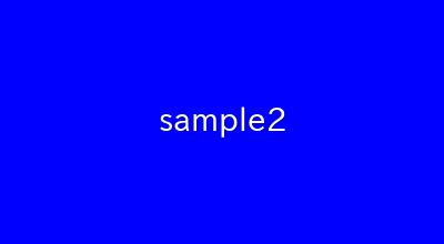
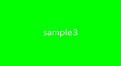
<div class="swiper-slide"><img src="./img/sample1.png"></div>
<div class="swiper-slide"><img src="./img/sample2.png"></div>
<div class="swiper-slide"><img src="./img/sample3.png"></div>
<div class="swiper-slide"><img src="./img/sample4.png"></div>
</div>
<div class="swiper-button-prev"></div> <!-- if navigation(arrows) is needed -->
<div class="swiper-button-next"></div> <!-- if navigation(arrows) is needed -->
<div class="swiper-pagination"></div> <!-- if pagination(dots) is needed -->
</div>・swiper
・swiper-wrapper
・swiper-slide
・swiper-button-prev
・swiper-button-next
・swiper-pagination
Only the class ‘sample-slider‘ is the custom class for this slider.
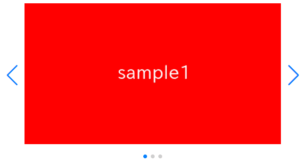
Adjust the Appearance with CSS
We reccomend to set the width of the slider in percentage, as this will automatically adjust the width of the slider according to the screen size.
Also, stretch the images to the full width.
.sample-slider {
    width:70%;
}
.sample-slider img {
    width: 100%;
    vertical-align: bottom;
}Additionally, if a value other than ‘bottom’ is specified for vertical-align, a small gap may appear below the image, so it’s convenient to always specify vertical-align: bottom.
Create a Slider with Javascript
Now, let’s finally create the Swiper slider using JavaScript.
If navigation and pagination are required, we need to include the corresponding code in the JavaScript as well.
const sampleSlider = new Swiper('.sample-slider', {
    // if navigation(arrows) is needed
    navigation: {
        nextEl: ".swiper-button-next",
        prevEl: ".swiper-button-prev",
    },
    // if pagination(dots) is needed
    pagination: {
        el: '.swiper-pagination',
    },
})The ‘swiper‘ class should not be specified because it is common class to all sliders for styling purposes.
Up to this point, the basic slider has been completed, so we provide a demo.
Next, let’s take a look at commonly used options.


If you want to customize navigation(arrows) and pagination(dots), the following article may be helpful.
★Customizing with Images
[Swiper]How to customize arrows of Swiper slider
[Swiper]How to customize pagination of Swiper slider
★Changing Size, Position, and Color
[Swiper]How to change size, position and color of arrows
[Swiper]How to change size, position and color of pagination
Basic options commonly used with Swiper
Since Swiper has too many options, let’s start by looking at the following frequently used four.
| Option | Description |
|---|---|
| speed | Specify the slide speed |
| loop | Make the slider loopable |
| autoplay | Set slider to autoplay |
| slidesPerView | Specify the number of displayed slides |
All options will be written in the second argument of new Swiper.
new Swiper('.sample-slider', {
    navigation: {
        nextEl: ".swiper-button-next",
        prevEl: ".swiper-button-prev",
    },
    pagination: {
        el: '.swiper-pagination',
    },
    // All options will be written here
})
speed option
You can specify the slide speed with the speed option (in milliseconds).
In the example below, the slide transition takes 4000 milliseconds(=4 seconds).
new Swiper('.sample-slider', {
    speed: 4000,
})
The slide will be move slowly, so please give it a try.
loop option
You can make the slider loopable using the loop option.
Loopable means that after the last slide is displayed, the first slide will come again for next.
new Swiper('.sample-slider', {
    loop: true,
})
The slider become loopable, so please give it a try.
autoplay option
You can enable auto-play for the slider using the autoplay option
The delay parameter specifies the time in milliseconds that each slide remains before transitioning to the next one.
new Swiper('.sample-slider', {
    autoplay: {
        delay: 3000,
    },
})
It will transition to the next slide automatically every 3000 milliseconds(=3 seconds).
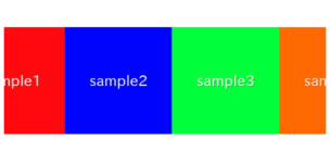
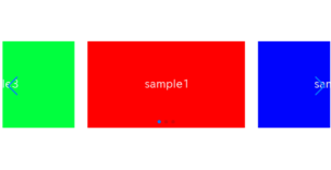
slidesPerView option
You can change the number of displayed slides with the slidesPerView option.
Specify the desired number of slides as the value.
new Swiper('.sample-slider', {
    slidesPerView: 3,
})
The number of visible slides has been changed to 3.
Another commonly used option that goes well with ‘slidesPerView’ is the spaceBetween option.
This option allows you to adjust the spacing between each slide.”
new Swiper('.sample-slider', {
    slidesPerView: 3,
    spaceBetween: 20,  // added
})
An example of a slider created using all the mentioned options is automatic infinite loop slider.
The way to create this slider is often seen on our site.
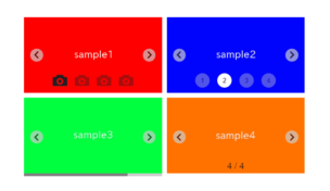
Pagination Options
Swiper also offers abundant pagination options, making it easy to customize pagination.
As an example, let’s try formatting the pagination as fractions.
new Swiper('.sample-slider', {
    pagination: {
        el: '.swiper-pagination',
        type: 'fraction',           // added
    },
})
You should now see that the pagination is displayed in fraction notation.
There are various options for pagination, and each of them can be easily customized.
We’ve compiled them here, so feel free to refer to it if you’re interested.
Responsive design
Swiper provides an option called breakpoints that makes responsive design easy.
By specifying as follows, you can switch the number of displayed slides between desktop and mobile.
new Swiper('.sample-slider', {
    breakpoints: {
        600: {
            // The number of displayed slides when the window width is 600 or more
            slidesPerView: 2
        },
    },
})
Furthermore, you can enable slider only for mobile using the methods provided by Swiper.
We’ve explained this in detail below, so please refer to it if you’re interested.
[Swiper] Responsive Slider with Breakpoints
[Swiper] How to Enable Slider Only For a Mobile
Animation Effects
Swiper provides a option which is called effect , allowing you to easily add animation effects.
As an example, let’s try the commonly seen fade animation for a smooth transition.
new Swiper('.sample-slider', {
    effect: 'fade',
    speed: 4000,
})
Now that it smoothly fades in and out, give it a try.
effectオプションは他にもあり、様々なアニメーション効果を付けることができます。
| Effect Type | Description |
|---|---|
| cube | An effect switches slides as if the 3D cube rotates. |
| cards | An effect that allows you to switch slides as if manipulating cards. |
| coverflow | An effect which slides are displayed with depth. |
| flip | An effect which slides flip (invert) when transitioning. |
| fade | An effect which slides fade in/out. |
| creative | An effect that allows you to create a original slider by adjusting the position and rotation of the previous and next slides. |
The other effect options are explained in below article.
Accessibility Improvements
Swiper.js allows you to improve the accessibility (usability) of sliders by using options.
For example, you can make the slider operatable by keyboards as shown below.
new Swiper('.sample-slider', {
    keyboard: true,     // make the slider operatable by keyboards
})
The slider has become operatable by keyboards, so please give it a try.
There is also an option called a11y which arrows you to create a slider that is easy for the visually impaired to operate.
Popular Sliders
With Swiper, you can create popular sliders commonly seen, such as the ones listed below.
These articles are also frequently viewed on our website.
Using Swiper with React or Vue
Swiper is compatible with modern JavaScript frameworks/libraries such as React or Vue.
However, please note that the loading and usage may vary slightly, so caution is needed when using Swiper with React or Vue.
I have explained how to use Swiper with React in the following article.
How to use Swiper.js with React
Our site doesn’t have the article for Vue, so we provide a link to the official documentation for reference.
Swiper Vue.js Components
That is all, it was about how to use Swiper.js.
