In this article, we will explain how to enable slider only for a mobile.
We are going to pursue the matter on the premise that you know how to make normal slider with Swiper.js. So if you are new to Swiper.js, firstly check the below article.
[Swiper] How to create a simple slider with swiper.js
Table of Contents
Create a normal swiper slider
For clarity, let’s start by creating a nomal swiper slider and then make modifications from there.
<link rel="stylesheet" href="https://cdn.jsdelivr.net/npm/swiper@8/swiper-bundle.min.css">
<script src="https://cdn.jsdelivr.net/npm/swiper@8/swiper-bundle.min.js"></script>

<style>
    .sample-slider{
        width:70%;
    }
    .sample-slider img{
        width: 100%;
    }
</style>

<div class="swiper sample-slider">
    <div class="swiper-wrapper">
        <div class="swiper-slide"><img src="img/sample1.png"></div>
        <div class="swiper-slide"><img src="img/sample2.png"></div>
        <div class="swiper-slide"><img src="img/sample3.png"></div>
        <div class="swiper-slide"><img src="img/sample4.png"></div>
    </div>
    <div class="swiper-pagination"></div>
    <div class="swiper-button-prev"></div>
    <div class="swiper-button-next"></div>
</div>

<script>
    const swiper = new Swiper('.sample-slider', {
        loop: true,                         // loop
        autoplay: {                         // autoplay
            delay: 2000,
        },
        pagination: {                       // pagination(dots)
            el: '.swiper-pagination',
        },
        navigation: {                       // navigation(arrows)
            nextEl: ".swiper-button-next",
            prevEl: ".swiper-button-prev",
        },
    })
</script>
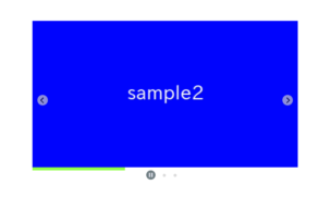
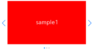
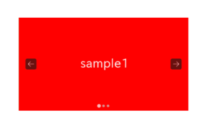
Now we can see a normal swiper slider.


Learn about the disable/enable methods
When you want to make it a slider only for mobile, disable/enable methods can be useful.
Let’s see the behavior.
const swiper = new Swiper('.sample-slider', {
    // Omitting options
})
swiper.disable()
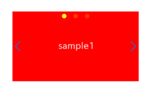
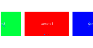
The arrows and dots are hidden, and swiping is disabled.
The disable method disables the created slider in this way.
The enable method reactivates the disabled slider.
Toggle slider enable/disable at a certain breakpoint
Let’s toggle the slider enable/disable at a certain breakpoint (in this case, 960px).
Additionally, let’s toggle a class (in this case, -non-slider) in order to add the styles to the disabled slider.
const swiper = new Swiper('.sample-slider', {
    loop: true,
    autoplay: {
        delay: 2000,
    },
    pagination: {
        el: '.swiper-pagination',
    },
    navigation: {
        nextEl: ".swiper-button-next",
        prevEl: ".swiper-button-prev",
    },
    /******* ↓ added ↓ ********/
    on: {
        resize: function enableOnlyMobile(swiper){
            // Disable the slider when the window width is less than or equal to 960
            if(960 < window.innerWidth){
                swiper.disable()
                swiper.el.classList.add('-non-slider')
            }else{
                swiper.enable()
                swiper.el.classList.remove('-non-slider')
            }
        },
    }
    /******* ↑ added ↑ ********/
})
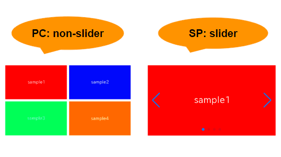
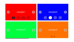
For those viewing on a PC, as you narrow the screen, the image below should turn into a slider.
For those on mobile, we apologize, you can see that the slider is disabled when viewed on a PC.
Define styles for when the slider is disabled
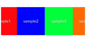
Even when disabled, there are some unnecessary styles that remain, so it's necessary to reset:
・Normalize the position of the slider
・Remove slide overlaps
・Initialize the width of the slides
・Remove slide duplicates (in the case of loop: true)
/* Styles for when the slider is disabled */
.sample-slider.-non-slider .swiper-wrapper {
    transform: inherit!important;                       /* Normalize the position of the slider */
    display: grid;                                      /* Remove slide overlaps */
    grid-template-columns: repeat(2, 1fr);              /* Any custom style */
    gap: 10px;                                          /* Any custom style */
}
.sample-slider.-non-slider .swiper-slide {
    width: inherit!important;                           /* Initialize the width of the slides */
}
.sample-slider.-non-slider .swiper-slide-duplicate {    /* Remove slide duplicates(loop:trueの場合) */
    display: none;
}
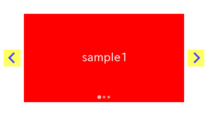
The slider, enabled only for mobile, is now completed!
For those on a PC, the gallery below will turn into a slider when you narrow the window width.
The full text of source code
In the end, we put the full text of source code.
<link rel="stylesheet" href="https://cdn.jsdelivr.net/npm/swiper@8/swiper-bundle.min.css">
<script src="https://cdn.jsdelivr.net/npm/swiper@8/swiper-bundle.min.js"></script>

<style>
    .sample-slider{
        width:70%;
    }
    .sample-slider img{
        width: 100%;
        vertical-align: bottom;
    }

    /* Styles for when the slider is disabled */
    .sample-slider.-non-slider .swiper-wrapper {
        transform: inherit!important;
        display: grid;
        grid-template-columns: repeat(2, 1fr);
        gap: 10px;
    }
    .sample-slider.-non-slider .swiper-slide {
        width: inherit!important;
    }
    .sample-slider.-non-slider .swiper-slide-duplicate {
        display: none;
    }
</style>

<div class="swiper sample-slider">
    <div class="swiper-wrapper">
        <div class="swiper-slide"><img src="./img/sample1.png"></div>
        <div class="swiper-slide"><img src="./img/sample2.png"></div>
        <div class="swiper-slide"><img src="./img/sample3.png"></div>
        <div class="swiper-slide"><img src="./img/sample4.png"></div>
    </div>
    <div class="swiper-pagination"></div>
    <div class="swiper-button-prev"></div>
    <div class="swiper-button-next"></div>
</div>

<script>
    const swiper = new Swiper('.sample-slider', {
        loop: true,
        autoplay: {
            delay: 2000,
        },
        pagination: {
            el: '.swiper-pagination',
        },
        navigation: {
            nextEl: ".swiper-button-next",
            prevEl: ".swiper-button-prev",
        },
        on: {
            resize: function enableOnlyMobile(swiper){
                // Disable the slider when the window width is less than or equal to 960
                if(960 < window.innerWidth){
                    swiper.disable()
                    swiper.el.classList.add('-non-slider')
                }else{
                    swiper.enable()
                    swiper.el.classList.remove('-non-slider')
                }
            },
        }
    })
</script>
That is all, it was about how to enable slider only for a mobile!
