Although there are many javascript libraries which can make a silder, swiper.js is the one of the most popular library which dose not require jQuery.
In this article, I will show you how to create a simple slider with swiper.js
Table of Contents
①load required libraries from CDN
<link rel="stylesheet" href="https://cdn.jsdelivr.net/npm/swiper@8/swiper-bundle.min.css">
<script src="https://cdn.jsdelivr.net/npm/swiper@8/swiper-bundle.min.js"></script>
The latest version is ver11, but there are still some lingering bugs in the loop system that have persisted since ver9. Therefore, we recommend to use ver8 for now.
You can always check latest version of swiper.js on the official website.
https://swiperjs.com/get-started#use-swiper-from-cdn
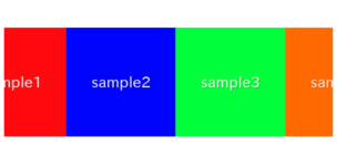
②HTML : prepare required parts for swiper slider
<div class="swiper sample-slider">
    <div class="swiper-wrapper">
        <div class="swiper-slide"><img src="img/sample1.png"></div>
        <div class="swiper-slide"><img src="img/sample2.png"></div>
        <div class="swiper-slide"><img src="img/sample3.png"></div>
    </div>
</div>Otherwise the layout may be skewed or slider may not work.
③Javascript : create a slider
In the first argument (“.sample-slider” part), you specify the class of the outermost container for the slider components created in HTML.
const swiper = new Swiper('.sample-slider', {

})
Now we can see a simple slider! The slide will move when you swipe.


④CSS : fixing the style with css
Let’s adjust slider width by CSS.
By using % instead of px for its width, the slider would be responsive.
.sample-slider{
    width:70%;
}
.sample-slider img{
    width: 100%;
}
Now the simple slider has been completed!
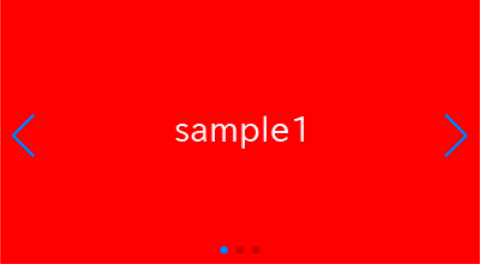
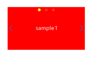
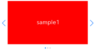
⑤Add Navigation
In Swiper.js, the left and right arrows are referred to as “navigation“.
<div class="swiper sample-slider">
    <div class="swiper-wrapper">
        <div class="swiper-slide"><img src="img/sample1.png"></div>
        <div class="swiper-slide"><img src="img/sample2.png"></div>
        <div class="swiper-slide"><img src="img/sample3.png"></div>
    </div>
    <div class="swiper-button-prev"></div>  <!-- added -->
    <div class="swiper-button-next"></div>  <!-- added -->
</div>
const swiper = new Swiper('.sample-slider', {
navigation: { //added
nextEl: ".swiper-button-next", //added
prevEl: ".swiper-button-prev", //added
}, //added
})
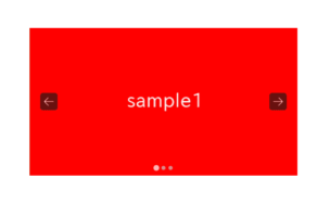
Navigation(arrows) has been added.
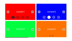
If you want to customize the navigation, please referer these.
[Swiper]How to customize arrows of Swiper slider
[Swiper]How to change size, position and color of arrows
⑥Add Pagination
In Swiper.js, the dots that indicate the current slide position are referred to as “pagination“.
<div class="swiper sample-slider">
    <div class="swiper-wrapper">
        <div class="swiper-slide"><img src="img/sample1.png"></div>
        <div class="swiper-slide"><img src="img/sample2.png"></div>
        <div class="swiper-slide"><img src="img/sample3.png"></div>
    </div>
    <div class="swiper-button-prev"></div>
    <div class="swiper-button-next"></div>
    <div class="swiper-pagination"></div>   <!-- added -->
</div>
const swiper = new Swiper('.sample-slider', {
navigation: {
nextEl: ".swiper-button-next",
prevEl: ".swiper-button-prev",
},
pagination: { //added
el: '.swiper-pagination', //added
}, //added
})
Pagination(dots) has been added.
If you want to customize the pagination, please referer these.
[Swiper]How to customize pagination of Swiper slider
[Swiper]How to change size, position and color of pagination
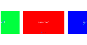
⑦Make the slider loop
One commonly used option is the loop option.
Enabling it makes the first slide appear again after the last slide, creating a loop.
Add loop:true to enable this feature.
const swiper = new Swiper('.sample-slider', {
    loop: true,         //added
    navigation: {
        nextEl: ".swiper-button-next",
        prevEl: ".swiper-button-prev",
    },
    pagination: {
        el: '.swiper-pagination',
    },
})
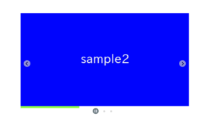
The slider has become to loop.
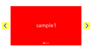
⑧Make the slider autoplay
Another commonly used option is the autoplay option.
The time interval until the next slide transition is determined by the value of “delay“.
In the following case, the slides will automatically switch every 2 seconds.
const swiper = new Swiper('.sample-slider', {
    loop: true,
    autoplay: {         //added
        delay: 2000,    //added
    },                  //added
    navigation: {
        nextEl: ".swiper-button-next",
        prevEl: ".swiper-button-prev",
    },
    pagination: {
        el: '.swiper-pagination',
    },
})
The slider has become to autoplay.
The full text of source code
In the end, I put the full text of source code.
<link rel="stylesheet" href="https://cdn.jsdelivr.net/npm/swiper@8/swiper-bundle.min.css">
<script src="https://cdn.jsdelivr.net/npm/swiper@8/swiper-bundle.min.js"></script>

<style>
    .sample-slider{
        width:70%;
    }
    .sample-slider img{
        width: 100%;
    }
</style>

<div class="swiper sample-slider">
    <div class="swiper-wrapper">
        <div class="swiper-slide"><img src="img/sample1.png"></div>
        <div class="swiper-slide"><img src="img/sample2.png"></div>
        <div class="swiper-slide"><img src="img/sample3.png"></div>
    </div>
    <div class="swiper-pagination"></div>
    <div class="swiper-button-prev"></div>
    <div class="swiper-button-next"></div>
</div>

<script>
  const swiper = new Swiper('.sample-slider', {
      loop: true,                         //loop
      autoplay: {                         //autoplay
          delay: 2000,
      },
      navigation: {                       //navigation(arrow)
          nextEl: ".swiper-button-next",
          prevEl: ".swiper-button-prev",
      },
      pagination: {                       //pagination(dots)
          el: '.swiper-pagination',
      },
  })
</script>
That’s all, it was about How to create a simple slider with swiper.js.
The following article provides a comprehensive explanation of Swiper.js, including options or customization methods. So please refer if you would like to learn more!
[Swiper] How to use and customize Swiper.js
