In this article, we are going to describe how to customize navigation(arrows) of Swiper slider.
We are going to pursue the matter on the premise that you know how to make normal slider with Swiper.js. So if you are new to Swiper.js, firstly check the below article.
[Swiper] How to create a simple slider with swiper.js
Table of Contents
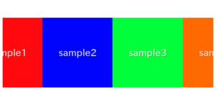
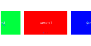
①Create a normal swiper slider
To make it crear, we will create normal swiper slider first and then make changes.
<link rel="stylesheet" href="https://cdn.jsdelivr.net/npm/swiper@8/swiper-bundle.min.css">
<script src="https://cdn.jsdelivr.net/npm/swiper@8/swiper-bundle.min.js"></script>

<style>
    .sample-slider{
        width:70%;
    }
    .sample-slider img{
        width: 100%;
    }
</style>

<div class="swiper sample-slider">
    <div class="swiper-wrapper">
        <div class="swiper-slide"><img src="img/sample1.png"></div>
        <div class="swiper-slide"><img src="img/sample2.png"></div>
        <div class="swiper-slide"><img src="img/sample3.png"></div>
    </div>
    <div class="swiper-pagination"></div>
    <div class="swiper-button-prev"></div>
    <div class="swiper-button-next"></div>
</div>

<script>
    const swiper = new Swiper('.sample-slider', {
        loop: true,                         //loop
        autoplay: {                         //autoplay
            delay: 2000,
        },
        pagination: {                       //pagination(dots)
            el: '.swiper-pagination',
        },
        navigation: {                       //navigation(arrows)
            nextEl: ".swiper-button-next",
            prevEl: ".swiper-button-prev",
        },
    })
</script>
Now we can see normal swiper slider.


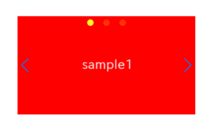
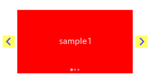
②Add arrows by img tag
Add img tag to above HTML.
The location is within the swiper-button-prev class and the swiper-button-next class.
<div class="swiper-button-prev">
    <img src="img/arrow_left.png">    <!--added-->
</div>
<div class="swiper-button-next">
    <img src="img/arrow_right.png">   <!--added-->
</div>
Now arrow image has been added.
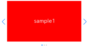
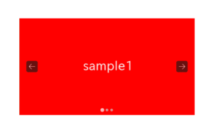
③Hide default arrow
let’s hide default arrows because we don’t need it.
The default arrows are set using the ::after pseudo-elements of the swiper-button-prev class and the swiper-button-next class, so we’ll disable them.
.sample-slider [class^="swiper-button-"]::after{
    content: "";
}
Default arrows have been gone.
④Adjust size and position of arrows
Adjust size and position of arrows by CSS.
/*adjust arrow size*/
.sample-slider [class^="swiper-button-"]{
    width: 55px;
    height: 55px;
}

/*adjust arrow position*/
.sample-slider .swiper-button-next{
    right: -5px;
}
.sample-slider .swiper-button-prev{
    left: -5px;
}
The full text of source code
In the end, I put the full text of source code.
<link rel="stylesheet" href="https://cdn.jsdelivr.net/npm/swiper@8/swiper-bundle.min.css">
<script src="https://cdn.jsdelivr.net/npm/swiper@8/swiper-bundle.min.js"></script>

<style>
    .sample-slider{
        width:70%;
    }
    .sample-slider img{
        width: 100%;
    }
    /*hide default arrows*/
    .sample-slider [class^="swiper-button-"]::after{
        content: "";
    }
    /*adjust arrow size*/
    .sample-slider [class^="swiper-button-"]{
        width: 55px;
        height: 55px;
    }
    /*adjust arrow position*/
    .sample-slider .swiper-button-next{
        right: -5px;
    }
    .sample-slider .swiper-button-prev{
        left: -5px;
    }
</style>


<div class="swiper sample-slider">
    <div class="swiper-wrapper">
        <div class="swiper-slide"><img src="img/sample1.png"></div>
        <div class="swiper-slide"><img src="img/sample2.png"></div>
        <div class="swiper-slide"><img src="img/sample3.png"></div>
    </div>
    <div class="swiper-pagination"></div>
    <div class="swiper-button-prev">
        <img src="img/arrow_left.png">    <!--arrow image-->
    </div>
    <div class="swiper-button-next">
        <img src="img/arrow_right.png">   <!--arrow image-->
    </div>
</div>

<script>
    const swiper = new Swiper('.sample-slider', {
        loop: true,                         //loop
        autoplay: {                         //autoplay
            delay: 2000,
        },
        pagination: {                       //pagination(dots)
            el: '.swiper-pagination',
        },
        navigation: {                       //navigation(arrows)
            nextEl: ".swiper-button-next",
            prevEl: ".swiper-button-prev",
        },
    })
</script>
That is all, it was about How to customize arrows of Swiper slider.
The main focus this time was customizing arrows with any desired image, but in the following article, we provide a detailed explanation on how to adjust the size, position, and color of arrows.
[Swiper]How to change size, position and color of arrows
If you want to know how to customize pagination, below article might be helpful.
[Swiper]How to customize pagination of Swiper slider


Followed the tutorial, just ran into one problem. My icons are disappearing after the first slide. Any idea how to fix that?
I am sorry for the late reply, Joe.
Can you show me the source code which you wrote?(if you still get the same problem)
Then I will try to clarify what is going on.
(I just tried to make swiper slider along with this article but did not get any problem..)