In this article, we will explain how to responsibly switch the displayed slides count for swiper slider based on the window width using breakpoints option.
We are going to pursue the matter on the premise that you know how to make normal slider with Swiper.js. So if you are new to Swiper.js, firstly check the below article.
[Swiper] How to create a simple slider with swiper.js
Table of Contents
Create a normal swiper slider
For clarity, let’s start by creating a nomal swiper slider and then make modifications from there.
<link rel="stylesheet" href="https://cdn.jsdelivr.net/npm/swiper@8/swiper-bundle.min.css">
<script src="https://cdn.jsdelivr.net/npm/swiper@8/swiper-bundle.min.js"></script>

<style>
    .sample-slider{
        width:70%;
    }
    .sample-slider img{
        width: 100%;
    }
</style>

<div class="swiper sample-slider">
    <div class="swiper-wrapper">
        <div class="swiper-slide"><img src="img/sample1.png"></div>
        <div class="swiper-slide"><img src="img/sample2.png"></div>
        <div class="swiper-slide"><img src="img/sample3.png"></div>
    </div>
    <div class="swiper-pagination"></div>
    <div class="swiper-button-prev"></div>
    <div class="swiper-button-next"></div>
</div>

<script>
    const swiper = new Swiper('.sample-slider', {
        loop: true,                         // loop
        autoplay: {                         // autoplay
            delay: 2000,
        },
        pagination: {                       // pagination(dots)
            el: '.swiper-pagination',
        },
        navigation: {                       // navigation(arrows)
            nextEl: ".swiper-button-next",
            prevEl: ".swiper-button-prev",
        },
    })
</script>
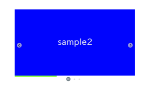
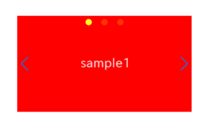
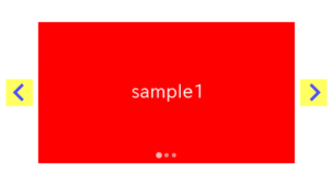
Now we can see a normal swiper slider.


Switching the displayed count by Breakpoint
Swiper.js provides a feature called breakpoints option, which allows you to switch options based on the specified breakpoint.
You can set additional options for window widths equal to or larger than the specified values (min-width-breakpoint).
const swiper = new Swiper('.sample-slider', {
    loop: true,
    autoplay: {
        delay: 2000,
    },
    pagination: {
        el: '.swiper-pagination',
    },
    navigation: {
        nextEl: ".swiper-button-next",
        prevEl: ".swiper-button-prev",
    },
    /******* ↓ added ↓ ********/
    slidesPerView: 1,   // When the window width is less than 600
    breakpoints: {
        600: {
            // When the window width is 600 or more
            slidesPerView: 2
        },
    },
    /******* ↑ added ↑ ********/
})
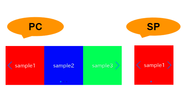
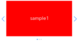
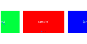
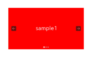
For those viewing on a PC, displayed slides count will be 1 when narrowing the window width.
For mobile users, we apologize, but if you could check on a PC, you should see that displayed slides count changes to 2.
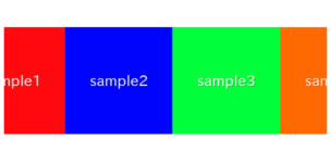
Setting Multiple Breakpoints
It’s also possible to set multiple breakpoints.
Simply add new breakpoints by separating them with commas.
const swiper = new Swiper('.sample-slider', {
    loop: true,
    autoplay: {
        delay: 2000,
    },
    pagination: {
        el: '.swiper-pagination',
    },
    navigation: {
        nextEl: ".swiper-button-next",
        prevEl: ".swiper-button-prev",
    },

    slidesPerView: 1,   // When the window width is less than 600
    breakpoints: {
        600: {
            // When the window width is 600 or more
            slidesPerView: 2
        },
        /******* ↓ added ↓ ********/
        960: {
            // When the window width is 960 or more
            slidesPerView: 3
        },
        /******* ↑ added ↑ ********/
    },
})
When Breakpoints Are Not Working
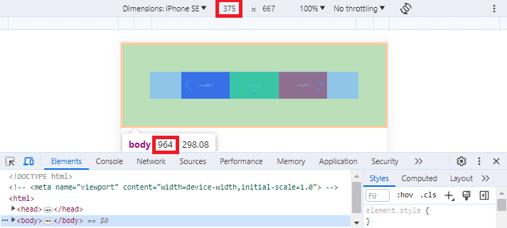
If the switch does not occur as expected at the specified breakpoint, it may be because you have not specified the viewport.
As shown below, in an environment without a specified viewport, you can see that even though it’s a smartphone with a width of 375px, the body size is 964px.
Adding the following code to the head tag may resolve the issue, so please try it out.
※But, be cautious as it might affect other parts of the development if it’s in progress.
<meta name="viewport" content="width=device-width,initial-scale=1.0">The full text of source code
In the end, we put the full text of source code.
<link rel="stylesheet" href="https://cdn.jsdelivr.net/npm/swiper@8/swiper-bundle.min.css">
<script src="https://cdn.jsdelivr.net/npm/swiper@8/swiper-bundle.min.js"></script>

<style>
    .sample-slider{
        width:70%;
    }
    .sample-slider img{
        width: 100%;
    }
</style>

<div class="swiper sample-slider">
    <div class="swiper-wrapper">
        <div class="swiper-slide"><img src="img/sample1.png"></div>
        <div class="swiper-slide"><img src="img/sample2.png"></div>
        <div class="swiper-slide"><img src="img/sample3.png"></div>
    </div>
    <div class="swiper-pagination"></div>
    <div class="swiper-button-prev"></div>
    <div class="swiper-button-next"></div>
</div>

<script>
    const swiper = new Swiper('.sample-slider', {
        loop: true,
        autoplay: {
            delay: 2000,
        },
        pagination: {
            el: '.swiper-pagination',
        },
        navigation: {
            nextEl: ".swiper-button-next",
            prevEl: ".swiper-button-prev",
        },
        slidesPerView: 1,   // When the window width is less than 600
        breakpoints: {
            600: {
                // When the window width is 600 or more
                slidesPerView: 2
            },
            960: {
                // When the window width is 960 or more
                slidesPerView: 3
            },
        },
    })
</script>
That is all, it was about how to create a responsive slider with breakpoints.
