swiper.js has many pagination option and we can easily create various pagination by only specify options.
In this article, I am going to describe about how to create various pagination of swiper with demo.
I’m going to pursue the matter on the premise that you know how to make normal slider with Swiper.js. So if you are new to Swiper.js, firstly check the below article.
[Swiper] How to create a simple slider with swiper.js
Table of Contents
- Create a normal swiper slider
- ≪clickable:true≫ Enable click pagination button
- ≪type: ‘progressbar’≫ Make pagination progressbar
- ≪progressbarOpposite: true≫ Make pagination vertical progressbar
- ≪type: ‘fraction’≫ Make pagination fraction
- ≪renderBullet≫ Make pagination numbers
- ≪dynamicBullets:true≫ Make pagination dynamic
- ≪hideOnClick:true≫ Enable to toggle the visibility of pagination
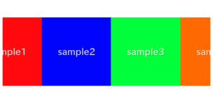
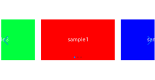
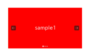
Create a normal swiper slider
To make it clear, we make a normal slider which be the basis.
<link rel="stylesheet" href="https://cdn.jsdelivr.net/npm/swiper@8/swiper-bundle.min.css">
<script src="https://cdn.jsdelivr.net/npm/swiper@8/swiper-bundle.min.js"></script>


<style>
    .swiper{
        width: 70%;
    }
    .swiper img{
        width: 100%;
    }
</style>


<div class="swiper swiper_main">
    <div class="swiper-wrapper">
        <div class="swiper-slide"><img src="./img/sample1.png"></div>
        <div class="swiper-slide"><img src="./img/sample2.png"></div>
        <div class="swiper-slide"><img src="./img/sample3.png"></div>
    </div>
    <div class="swiper-pagination"></div>
    <div class="swiper-button-prev"></div>
    <div class="swiper-button-next"></div>
</div>


<script>
    const swiper_main = new Swiper('.swiper_main', {
        loop: true,
        pagination: {
            el: '.swiper-pagination',
        },
        navigation: {
            nextEl: ".swiper-button-next",
            prevEl: ".swiper-button-prev",
        },
    })
</script>
Now a normal slider has been created.
Lets try to create various pagination by changing this code.


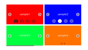
≪clickable:true≫ Enable click pagination button
We can not click pagination button by defaul setting.
By adding clickable option as below, we can be able to click the pagination button and the slide will move.
const swiper = new Swiper('.sample-slider', {
    loop: true,
    pagination: {
        el: '.swiper-pagination',
        clickable: true,            //added
    },
    navigation: {
        nextEl: ".swiper-button-next",
        prevEl: ".swiper-button-prev",
    },
})
If you click the pagination button and the slide move,it is OK.
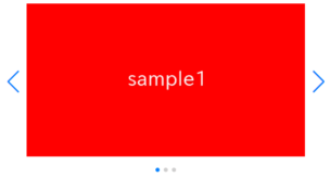
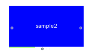
≪type: ‘progressbar’≫ Make pagination progressbar
We can make pagination progressbar, by adding type: ‘progressbar’ as below.
const swiper = new Swiper('.sample-slider', {
    loop: true,
    pagination: {
        el: '.swiper-pagination',
        type: 'progressbar',        //added
    },
    navigation: {
        nextEl: ".swiper-button-next",
        prevEl: ".swiper-button-prev",
    },
})
Now the pagination become progressbar.
If you want to place the progress bar at the very bottom, you can achieve this by adding the following CSS as shown below.
.sample-slider .swiper-pagination{
top:initial;
bottom:0;
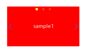
}≪progressbarOpposite: true≫ Make pagination vertical progressbar
We can make pagination vertical progressbar By adding type: ‘progressbar’ and progressbarOpposite: true as below.
const swiper = new Swiper('.sample-slider', {
    loop: true,
    pagination: {
        el: '.swiper-pagination',
        type: 'progressbar',            //added
        progressbarOpposite: true,      //added
    },
    navigation: {
        nextEl: ".swiper-button-next",
        prevEl: ".swiper-button-prev",
    },
})
Now the pagination become vertical progressbar.
≪type: ‘fraction’≫ Make pagination fraction
We can make pagination fraction by adding type: ‘fraction’ as below.
const swiper = new Swiper('.sample-slider', {
    loop: true,
    pagination: {
        el: '.swiper-pagination',
        type: 'fraction',           //added
    },
    navigation: {
        nextEl: ".swiper-button-next",
        prevEl: ".swiper-button-prev",
    },
})
Now the pagination become fraction.
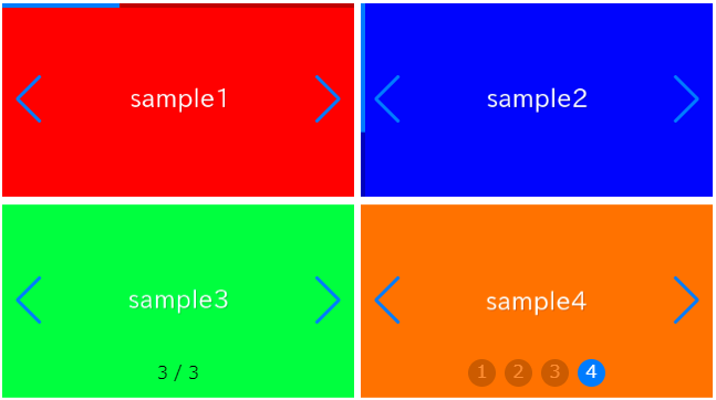
≪renderBullet≫ Make pagination numbers
We can make pagination numbers by adding closure on renderBullet option.
Css is needed to adjust the style.
<style>
    .sample-slider .swiper-pagination-bullet{   /*added*/
        width: 25px;                            /*added*/
        height: 25px;                           /*added*/
        display: inline-flex;                   /*added*/
        align-items: center;                    /*added*/
        justify-content: center;                /*added*/
        color: #fff;                            /*added*/
    }                                           /*added*/
</style>


<script>
    const swiper = new Swiper('.sample-slider', {
        loop: true,
        pagination: {
            el: '.swiper-pagination',
            renderBullet: function (index, className) {                 //added
                return `<span class="${className}">${index + 1}</span>` //added
            },                                                          //added
        },
        navigation: {
            nextEl: ".swiper-button-next",
            prevEl: ".swiper-button-prev",
        },
    })
</script>
Now the pagination become numbers.
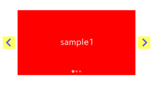
≪dynamicBullets:true≫ Make pagination dynamic
We can make pagination dynamic By adding dynamicBullets: true as below.
The active pagination button will be larger.
const swiper = new Swiper('.sample-slider', {
    loop: true,
    pagination: {
        el: '.swiper-pagination',
        dynamicBullets: true,
    },
    navigation: {
        nextEl: ".swiper-button-next",
        prevEl: ".swiper-button-prev",
    },
})
≪hideOnClick:true≫ Enable to toggle the visibility of pagination
We can enable to toggle the visibility of pagination By adding hideOnClick: true as below.
const swiper = new Swiper('.sample-slider', {
    loop: true,
    pagination: {
        el: '.swiper-pagination',
        hideOnClick: true,          // added
    },
    navigation: {
        nextEl: ".swiper-button-next",
        prevEl: ".swiper-button-prev",
    },
})
If you click the slide, the pagination will be hidden. If you click the pagination again, the pagination will be shown.
That is all, it was about how to create various pagination of swiper slider.
If you want to know how to replace the pagination with any images, below article might be helpful
[Swiper]How to customize pagination of Swiper slider

How do you move the progress bar below the slider?
Thanks for your comment, Sam!
If you want to place the progress bar at the bottom-most, you can achieve this by adding the following CSS.
.sample-slider .swiper-pagination{
    top:initial;
    bottom:0;
}
If you want to place the progress bar below the slider, you can achieve this by adding the following CSS.
.sample-slider{
    padding-bottom: 10px;
}
.sample-slider .swiper-pagination{
    top:initial;
    bottom:0;
}