Swiper.js which is one of the most popular javascript slider library has lots of options.
In this article, I am going to describe about how to improve accessibility of swiper slider with demos.
By implementing the following four, we will improve accessibility.
- Make the pagination clickable
- Make the slider operatable by keyboards
- Make the slider operatable by mousewheel
- Set up the message for screen readers (a11y)
Table of Contents
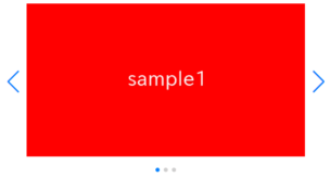
Create a normal swiper slider
To make it clear, we will create normal swiper slider first and then make changes.
<link rel="stylesheet" href="https://cdn.jsdelivr.net/npm/swiper@8/swiper-bundle.min.css">
<script src="https://cdn.jsdelivr.net/npm/swiper@8/swiper-bundle.min.js"></script>

<style>
    .sample-slider{
        width:70%;
    }
    .sample-slider img{
        width: 100%;
    }
</style>

<div class="swiper sample-slider">
    <div class="swiper-wrapper">
        <div class="swiper-slide"><img src="img/sample1.png"></div>
        <div class="swiper-slide"><img src="img/sample2.png"></div>
        <div class="swiper-slide"><img src="img/sample3.png"></div>
    </div>
    <div class="swiper-pagination"></div>
    <div class="swiper-button-prev"></div>
    <div class="swiper-button-next"></div>
</div>

<script>
    const swiper = new Swiper('.sample-slider', {
        loop: true,                         //loop
        pagination: {                       //pagination(dots)
            el: '.swiper-pagination',
        },
        navigation: {                       //navigation(arrows)
            nextEl: ".swiper-button-next",
            prevEl: ".swiper-button-prev",
        },
    })
</script>
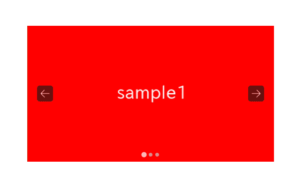
Now we can see a noraml swiper slider.


Make the pagination clickable
By specifying clickable: true in pagination option, the users will be able to operate the slide by clicking the pagination.
const swiper = new Swiper('.sample-slider', {
    loop: true,
    pagination: {
        el: '.swiper-pagination',
        clickable: true,            //added
    },
    navigation: {
        nextEl: ".swiper-button-next",
        prevEl: ".swiper-button-prev",
    },
})
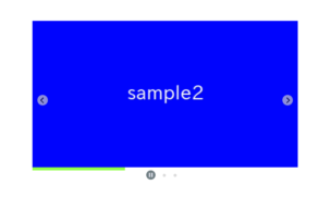
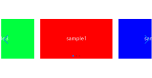
The pagination has become clickable.
When you click the pagination, the slide will move.
Make the slider operatable by keyboards
By adding keyboard: true, the users will be able to operate the slider by keyboards.
const swiper = new Swiper('.sample-slider', {
    loop: true,
    pagination: {
        el: '.swiper-pagination',
        clickable: true,
    },
    navigation: {
        nextEl: ".swiper-button-next",
        prevEl: ".swiper-button-prev",
    },
    keyboard: true,                 //added
})
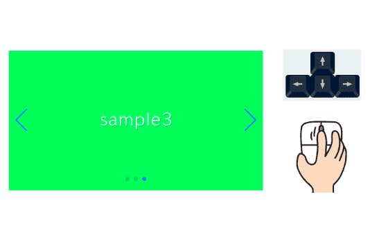
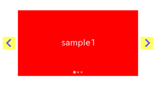
The slider has become operatable by keyboards.
After clicking pagination or navigation, if you click right arrow key or left arrow key the slide will move.
Make the slider operatable by mousewheel
By adding mousewheel: true, the users will be able to operate the slider by mousewheel or trackpad.
const swiper = new Swiper('.sample-slider', {
    loop: true,
    pagination: {
        el: '.swiper-pagination',
        clickable: true,
    },
    navigation: {
        nextEl: ".swiper-button-next",
        prevEl: ".swiper-button-prev",
    },
    keyboard: true,
    mousewheel: true,               //追加
}
The slider has become operatable by mousewheel or trackpad.
By only adding mousewheel: true, sometimes the slide moves more than once when you operate by trackpad.
To improve this, change the mousewheel option as below.
The higher the numbers of thresholdDelta, the more reactive the slide. I think 70 is just right.
const swiper = new Swiper('.sample-slider', {
    .
    .
    .
    //mousewheel: true,                 //removed
    mousewheel: {                       //added
        thresholdDelta: 70,             //added
    },                                  //added
}
I think the slide no more move more than once when you operate by trackpad.
After enabled mousewheel option, the slider will react against the scrolling in both of vertical and horizontal direction.
Perhaps some users feel anoyed because they were going to scroll the window but the slider reacted. There is a way to make the slider to react when only scrolling in horizontal direction.
By specifying forceToAxis: true in mousewheel option, the slider become to react only when the scroll direction is same with slider direction.
const swiper = new Swiper('.sample-slider', {
    .
    .
    .
    mousewheel: {
        thresholdDelta: 70,
        forceToAxis: true,      //added
    },                          //added
}
The slider has become to react when only scrolling in horizontal direction.
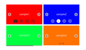
Set up the message for screen readers (a11y)
Swiper.js provides an option called a11y that allows you to set a message for the screen reader.
By using this, you can create sliders that are easier to operate for individuals with visual impairments.
The a11y options include the following.
| Option | Default Value | Description | Attribute to be set |
|---|---|---|---|
| containerMessage | null | Message to describe the container | aria-label for the “swiper” class |
| containerRoleDescriptionMessage | null | Message to provide detailed explanation of the container’s role | aria-roledescription for the “swiper” class |
| nextSlideMessage | ‘Next slide’ | Message for the Next button | aria-label for the “swiper-button-next” class |
| prevSlideMessage | ‘Previous slide’ | Message for the Back button | aria-label for the “swiper-button-prev” class |
| paginationBulletMessage | ‘Go to slide {{index}}’ | Message for each pagination button (only available when clickable option is true). | aria-label for the “swiper-pagination-bullet” class |
| slideLabelMessage | ‘{{index}} / {{slidesLength}}’ | Message for each slide (indicating which slide out of how many) | aria-label for the “swiper-slide” class |
| slideRole | ‘group’ | Message to describe the role of the slide | aria-role for the “swiper-slide” class |
| itemRoleDescriptionMessage | null | Message to describe the role of the slide in detail | aria-roledescription “swiper-slide” class |
Here is a example of setting.
const swiper = new Swiper('.sample-slider', {
    .
    .
    .
    a11y: {
        containerMessage: 'This is a sample slider',                    // Message to describe the container
        containerRoleDescriptionMessage: 'Slider Container',            // Message to provide detailed explanation of the container's role
        nextSlideMessage: 'Button for the next slide',                  // Message for the Next button
        prevSlideMessage: 'Button for the previous slide',              // Message for the Back button
        paginationBulletMessage: 'Button to jump to slide {{index}}',   // Message for each pagination button (only available when clickable option is true).
        slideLabelMessage: 'Slide {{index}} of {{slidesLength}}',       // Message for each slide (indicating which slide out of how many)
        slideRole: 'group',                                             // Message to describe the role of the slide
        itemRoleDescriptionMessage: 'Slide group',                      // Message to describe the role of the slide in detail
    }
})
The full text of source code
In the end, I put the full text of source code.
I have left the comments for only the options which is described int this article.
<link rel="stylesheet" href="https://cdn.jsdelivr.net/npm/swiper@8/swiper-bundle.min.css">
<script src="https://cdn.jsdelivr.net/npm/swiper@8/swiper-bundle.min.js"></script>

<style>
    body{
        padding:100px;
    }
    .sample-slider{
        width:70%;
    }
    .sample-slider img{
        width: 100%;
    }
</style>


<div class="swiper sample-slider">
    <div class="swiper-wrapper">
        <div class="swiper-slide"><img src="./img/sample1.png"></div>
        <div class="swiper-slide"><img src="./img/sample2.png"></div>
        <div class="swiper-slide"><img src="./img/sample3.png"></div>
    </div>
    <div class="swiper-pagination"></div>
    <div class="swiper-button-prev"></div>
    <div class="swiper-button-next"></div>
</div>


<script>
    const swiper = new Swiper('.sample-slider', {
        loop: true,
        pagination: {
            el: '.swiper-pagination',
            clickable: true,                //Make the pagination clickable
        },
        navigation: {
            nextEl: ".swiper-button-next",
            prevEl: ".swiper-button-prev",
        },
        keyboard: true,
        keyboard: true,                     //make the slider operatable by keyboards
        mousewheel: {                       //make the slider operatable by mousewheel or trackpad
            thresholdDelta: 70,             //adjust reactivity for mousewheel scrolling
            forceToAxis: true,              //make the slider to react only when the scroll direction is same with slider direction.
        },
        a11y: {
            containerMessage: 'This is a sample slider',                    // Message to describe the container
            containerRoleDescriptionMessage: 'Slider Container',            // Message to provide detailed explanation of the container's role
            nextSlideMessage: 'Button for the next slide',                  // Message for the Next button
            prevSlideMessage: 'Button for the previous slide',              // Message for the Back button
            paginationBulletMessage: 'Button to jump to slide {{index}}',   // Message for each pagination button (only available when clickable option is true).
            slideLabelMessage: 'Slide {{index}} of {{slidesLength}}',       // Message for each slide (indicating which slide out of how many)
            slideRole: 'group',                                             // Message to describe the role of the slide
            itemRoleDescriptionMessage: 'Slide group',                      // Message to describe the role of the slide in detail
        }
    })
</script>
That is all, it was about how to improve accessibility of swiper slider by implementing the following four.
- Make the pagination clickable
- Make the slider operatable by keyboards
- Make the slider operatable by mousewheel
- Set up the message for screen readers (a11y)
