It seems that Splide.js currently boasts three times the hits of the popular slider library, Swiper.js.
In this article, we will describe how to create a simple slider using Splide.js.
Table of Contents
①Load required libraries from CDN
<script src="https://cdn.jsdelivr.net/npm/@splidejs/splide@4/dist/js/splide.min.js"></script>
<link href="https://cdn.jsdelivr.net/npm/@splidejs/splide@4/dist/css/splide.min.css" rel="stylesheet">
Here, we are using the latest version, ver4, as of February 2024.
You can always check the latest version of Splide.js here.
https://www.jsdelivr.com/package/npm/@splidejs/splide?path=dist
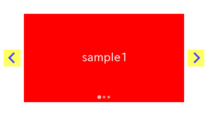
②HTML : prepare required parts for splide slider
<div class="splide sample-slider">
<div class="splide__track">
<ul class="splide__list">
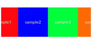
<li class="splide__slide"><img src="./img/sample1.png"></li>
<li class="splide__slide"><img src="./img/sample2.png"></li>
<li class="splide__slide"><img src="./img/sample3.png"></li>
</ul>
</div>
</div>・splide
・splide__track
・splide__list
・splide__slide
③Javascript : create a splide slider
You can specify options in the second argument, but here we have left it empty for now.
new Splide('.sample-slider', {

}).mount()
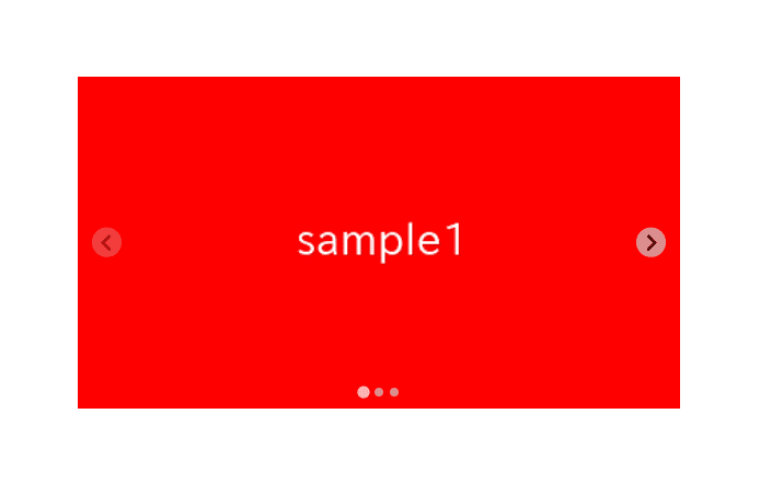
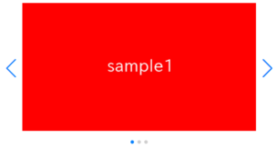
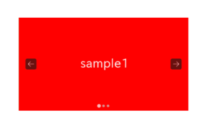
Although the appearance is still distorted, we have managed to create the slider.
In Splide.js, arrows and dots appear by default.


④CSS : fixing the style
Let’s adjust the width of the slider using CSS.
Specifying the width in percentage allows the slider size to automatically adjust according to the window width, which is convenient.
.sample-slider {
    width: 70%;
    margin: 0 auto;
}
.sample-slider img {
    width: 100%;
}
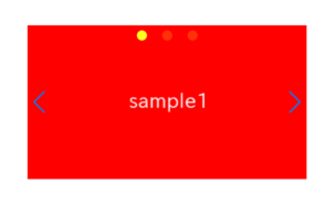
Now the simple splide slider has been completed!
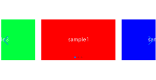
⑤Hide arrows and dots
In Splide.js, arrows and dots (pagination) are displayed by default, but there are times when you may not need them.
In such cases, you can easily hide the arrows and dots using options in the second argument.
new Splide('.sample-slider', {
    arrows: false,      // added(hide arrows)
    pagination: false,  // added(hide dots)
}).mount()
Now the arrows and dots have been hidden.
⑥Make the slider loop
One commonly used option is the loop option.
Enabling it makes the first slide appear again after the last slide, creating a loop.
To enable looping, add type: ‘loop’ to the options.
new Splide('.sample-slider', {
    type : 'loop',  // added
}).mount()
Now, the splide slider has become to loop.
⑦Make the slider autoplay
Another commonly used option is the autoplay option.
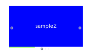
By adding autoplay: true, you can enable automatic playback of the slider.
You can specify the interval for autoplay using the interval option (it is set to 5000, which equals 5 seconds if not specified).
new Splide('.sample-slider', {
    type : 'loop',
    autoplay: true,         // added (autoplay)
    interval: 1500,         // added (interval for autoplay)
}).mount()
The slider is now set to autoplay.
The slides will automatically switch every 1.5 seconds.
The Autoplay option in Splide.js not only enables autoplay, but also offers rich functionality such as displaying a progress bar, making certain slides appear longer etc.
So if you want to learn more about it, please refer to the following.
Make the most of the Autoplay option in Splide.js
The full text of source code
In the end, we put the full text of source code.
<script src="https://cdn.jsdelivr.net/npm/@splidejs/splide@4/dist/js/splide.min.js"></script>
<link href="https://cdn.jsdelivr.net/npm/@splidejs/splide@4/dist/css/splide.min.css" rel="stylesheet">

<style>
    .sample-slider {
        width: 70%;
        margin: 0 auto;
    }
    .sample-slider img {
        width: 100%;
    }
</style>

<div class="splide sample-slider">
    <div class="splide__track">
          <ul class="splide__list">
              <li class="splide__slide"><img src="./img/sample1.png"></li>
              <li class="splide__slide"><img src="./img/sample2.png"></li>
              <li class="splide__slide"><img src="./img/sample3.png"></li>
          </ul>
    </div>
</div>

<script>
    new Splide('.sample-slider', {
        arrows: false,      // hide arrows
        pagination: false,  // hide dots
        type : 'loop',      // make the slider loop
        autoplay: true,     // make the slider autoplay
        interval: 1500,     // interval for autoplay
    }).mount()
</script>
That is all, it was about how to create a simple slider with Splide.js.
In this article, we only explained how to create a simple slider, but sliders usually have various designs depending on the website. Among them, there is often a unique design for arrows and pagination (dots).
The following article describes how to customize the arrows or pagination of a slider created with Splide.js.
[Splide] How to customize arrows of Splide slider
[Splide] How to customize pagination of Splide slider
