当記事ではHTMLとCSSのみでトグルボタンを作る方法とデザインサンプルを5選紹介します。
①HTMLでパーツを用意
作り方の方向性として、チェックボックスの機能を使いつつ、divタグでトグルボタンを作ることにします(チェックボックスの見た目はあまり変更できないため)。
<label class="toggle">
    <input type="checkbox">
    <div></div>
</label>
②トグルボタンの枠を用意する
CSSでトグルボタンの枠を用意します。
カスタムプロパティを使ってwidthを基準にheightやborder-radiusが決まるようにしておくと便利です。
.toggle > div {
    --width: 100px;
    width: var(--width);
    height: calc(var(--width) / 2);
    border-radius: calc(var(--width) / 2);
    background: gray;
    cursor: pointer;
    position: relative;
    display: inline-block;
}
枠ができました。
枠をクリックするとチェックボックスが切り替わると思うので、確認してみてください。
③トグルボタンの丸を用意する
枠に対して::before疑似要素を使って、丸を作ります。
ゆっくり動くようにtransitionも付けておきましょう。
.toggle > div::before {
    content: "";
    display: block;
    width: 50%;
    height: 100%;
    border-radius: 50%;
    background: #fff;
    transition: 0.5s;
    box-shadow: 0 0 8px gray;
}
見た目はいい感じになりました。
まだクリックしても丸は動きません。
④トグルボタンの丸を動かす
:checked疑似クラスと隣接セレクタを使って、オンになったチェックボックスの隣(=枠)の:before(=丸)を動かすようにします。
.toggle [type=checkbox]:checked + div::before {
    transform: translateX(100%);
}
クリックすると丸が動くと思うので、確認してみてください。
⑤オンになった時に背景色をつける
これも先ほど同様、:checked疑似クラスと隣接セレクタを使用して実現します。
チェックボックスをついでに非表示にしたら完成です。
.toggle [type=checkbox]:checked + div {
    background: lightgreen;
}
.toggle [type=checkbox] {
    display: none;
}
トグルボタンが完成しました!
ソースコード全文
一旦ここまでのソースコードを載せておきます。
一番下にデザインサンプルを5選載せているので、ご希望に近いものがあるか探してみてください!
<style>
.toggle > div {
--width: 100px;
width: var(--width);
height: calc(var(--width) / 2);
border-radius: calc(var(--width) / 2);
background: gray;
cursor: pointer;
position: relative;
display: inline-block;
}
.toggle > div::before {
content: "";
display: block;
width: 50%;
height: 100%;
border-radius: 50%;
background: #fff;
transition: 0.5s;
box-shadow: 0 0 8px gray;
}
.toggle [type=checkbox]:checked + div {
background: lightgreen;
}
.toggle [type=checkbox]:checked + div:before {
transform: translateX(100%);
}
.toggle [type=checkbox] {
display: none;
}
</style>
<label class="toggle">
<input type="checkbox">
<div></div>
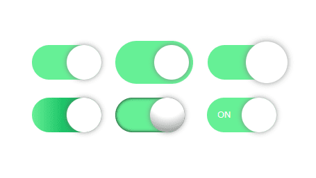
</label>トグルボタンのデザインサンプル5選
トグルボタンのデザインサンプルを5選紹介します。
すべてのサンプルは先ほどのソースコードを基準に、クラスと少しのCSSの追加でできるようになっています。
デザインサンプル1:縁あり
<!-- <label class="toggle"> --> <!-- 削除 -->
<label class="toggle -edge">    <!-- 追加 -->
    <input type="checkbox">
    <div></div>
</label>
.toggle.-edge > div {
padding: 6px;
box-sizing: initial;
}ソースコード全文を見る
<style>
    .toggle > div {
        --width: 100px;
        width: var(--width);
        height: calc(var(--width) / 2);
        border-radius: calc(var(--width) / 2);
        background: gray;
        cursor: pointer;
        position: relative;
        display: inline-block;
    }
    .toggle > div::before {
        content: "";
        display: block;
        width: 50%;
        height: 100%;
        border-radius: 50%;
        background: #fff;
        transition: 0.5s;
        box-shadow: 0 0 8px gray;
    }
    .toggle [type=checkbox]:checked + div {
        background: lightgreen;
    }
    .toggle [type=checkbox]:checked + div:before {
        transform: translateX(100%);
    }
    .toggle [type=checkbox] {
        display: none;
    }

    .toggle.-edge > div {
        padding: 6px;
    }
</style>

<label class="toggle -edge">
    <input type="checkbox">
    <div></div>
</label>
デザインサンプル2:大きな丸
<!-- <label class="toggle"> -->     <!-- 削除 -->
<label class="toggle -bigcircle">   <!-- 追加 -->
    <input type="checkbox">
    <div></div>
</label>
.toggle.-bigcircle > div::before {
scale: 1.2;
}ソースコード全文を見る
<style>
.toggle > div {
--width: 100px;
width: var(--width);
height: calc(var(--width) / 2);
border-radius: calc(var(--width) / 2);
background: gray;
cursor: pointer;
position: relative;
display: inline-block;
}
.toggle > div::before {
content: "";
display: block;
width: 50%;
height: 100%;
border-radius: 50%;
background: #fff;
transition: 0.5s;
box-shadow: 0 0 8px gray;
}
.toggle [type=checkbox]:checked + div {
background: lightgreen;
}
.toggle [type=checkbox]:checked + div:before {
transform: translateX(100%);
}
.toggle [type=checkbox] {
display: none;
}
.toggle.-bigcircle > div::before {
    scale: 1.2;
}
</style>
<label class="toggle -bigcircle">
<input type="checkbox">
<div></div>
</label>デザインサンプル3:グラデーション
<!-- <label class="toggle"> -->     <!-- 削除 -->
<label class="toggle -gradient">    <!-- 追加 -->
    <input type="checkbox">
    <div></div>
</label>
.toggle.-gradient [type=checkbox]:checked + div {
background: linear-gradient(to right, lightgreen, forestgreen 99%);
}ソースコード全文を見る
<style>
.toggle > div {
--width: 100px;
width: var(--width);
height: calc(var(--width) / 2);
border-radius: calc(var(--width) / 2);
background: gray;
cursor: pointer;
position: relative;
display: inline-block;
}
.toggle > div::before {
content: "";
display: block;
width: 50%;
height: 100%;
border-radius: 50%;
background: #fff;
transition: 0.5s;
box-shadow: 0 0 8px gray;
}
.toggle [type=checkbox]:checked + div {
background: lightgreen;
}
.toggle [type=checkbox]:checked + div:before {
transform: translateX(100%);
}
.toggle [type=checkbox] {
display: none;
}
.toggle.-gradient [type=checkbox]:checked + div {
    background: linear-gradient(to right, lightgreen, forestgreen 99%);
}
</style>
<label class="toggle -gradient">
<input type="checkbox">
<div></div>
</label>デザインサンプル4:立体的
<!-- <label class="toggle"> --> <!-- 削除 -->
<label class="toggle -threeD">  <!-- 追加 -->
    <input type="checkbox">
    <div></div>
</label>
.toggle.-threeD > div {
box-shadow: 0px 0px 5px inset;
}
.toggle.-threeD > div::before {
background-image: radial-gradient(circle at top, white 50%, gray);
}ソースコード全文を見る
<style>
    .toggle > div {
        --width: 100px;
        width: var(--width);
        height: calc(var(--width) / 2);
        border-radius: calc(var(--width) / 2);
        background: gray;
        cursor: pointer;
        position: relative;
        display: inline-block;
    }
    .toggle > div::before {
        content: "";
        display: block;
        width: 50%;
        height: 100%;
        border-radius: 50%;
        background: #fff;
        transition: 0.5s;
        box-shadow: 0 0 8px gray;
    }
    .toggle [type=checkbox]:checked + div {
        background: lightgreen;
    }
    .toggle [type=checkbox]:checked + div:before {
        transform: translateX(100%);
    }
    .toggle [type=checkbox] {
        display: none;
    }

    .toggle.-threeD > div {
        box-shadow: 0px 0px 5px inset;
    }
    .toggle.-threeD > div::before {
        background-image: radial-gradient(
            circle at top,
            white 50%,
            gray
        );
    }
</style>

<label class="toggle -threeD">
    <input type="checkbox">
    <div></div>
</label>
デザインサンプル5:テキスト付き
※カスタムプロパティを使う事によって、HTML側でテキストの内容を指定できます。
<!-- <label class="toggle"> -->                                                 <!-- 削除 -->
<label class="toggle -withtext" style="--true-text:'ON'; --false-text:'OFF';">  <!-- 追加 -->
    <input type="checkbox">
    <div></div>
</label>
.toggle.-withtext > div:after {
content: var(--false-text);
position: absolute;
right: 15%;
top: 50%;
transform: translateY(-50%);
color: #fff;
font-size: 13px;
}
.toggle.-withtext [type=checkbox]:checked + div:after {
content: var(--true-text);
left: 15%;
}ソースコード全文を見る
<style>
.toggle > div {
--width: 100px;
width: var(--width);
height: calc(var(--width) / 2);
border-radius: calc(var(--width) / 2);
background: gray;
cursor: pointer;
position: relative;
display: inline-block;
}
.toggle > div::before {
content: "";
display: block;
width: 50%;
height: 100%;
border-radius: 50%;
background: #fff;
transition: 0.5s;
box-shadow: 0 0 8px gray;
}
.toggle [type=checkbox]:checked + div {
background: lightgreen;
}
.toggle [type=checkbox]:checked + div:before {
transform: translateX(100%);
}
.toggle [type=checkbox] {
display: none;
}
.toggle.-withtext > div:after {
    content: var(--false-text);
    position: absolute;
    right: 15%;
    top: 50%;
    transform: translateY(-50%);
    color: #fff;
    font-size: 13px;
}
.toggle.-withtext [type=checkbox]:checked + div:after {
    content: var(--true-text);
    left: 15%;
}
</style>
<label class="toggle -withtext" style="--true-text:'ON'; --false-text:'OFF';">
<input type="checkbox">
<div></div>
</label>以上、HTMLとCSSのみでトグルボタンを作る方法とデザインサンプル5選でした!