In this article, we will introduce how to create a toggle switch using only HTML and CSS and introduce 5 designs.
Table of Contents
①Prepare parts of toggle switch with HTML
Let’s start by preparing the parts of toggle switch with HTML.
We will use the functionality of checkboxes and create a toggle switch with div tags (since the appearance of checkboxes is not easily customizable).
<label class="toggle">
    <input type="checkbox">
    <div></div>
</label>
②Create the frame of the toggle switch
Let’s create the frame of the toggle switch with CSS.
It is convenient to use custom properties to determine the height and border-radius based on the width.
.toggle > div {
    --width: 100px;
    width: var(--width);
    height: calc(var(--width) / 2);
    border-radius: calc(var(--width) / 2);
    background: gray;
    cursor: pointer;
    position: relative;
    display: inline-block;
}
The frame is now in place.
Checkbox will be toggled when the frame is clicked, so please give it a try.
③Create the circle for the toggle switch
Use the ::before pseudo-element on the frame to create the circle.
Let’s also add a transition to make it move smoothly.
.toggle > div::before {
    content: "";
    display: block;
    width: 50%;
    height: 100%;
    border-radius: 50%;
    background: #fff;
    transition: 0.5s;
    box-shadow: 0 0 8px gray;
}
The appearance looks good now.
However, the circle still doesn’t move even if clicked.
④Move the circle of the toggle switch
Utilize the :checked pseudo-class and adjacent sibling selector to move the circle.
.toggle [type=checkbox]:checked + div::before {
    transform: translateX(100%);
}
The circle will move when clicked, so please give it a try.
⑤Apply a background color when it is turned on
Similar to before, achieve this by using the :checked pseudo-class and adjacent sibling selector.
Once you hide the checkbox, it’s complete.
.toggle [type=checkbox]:checked + div {
    background: lightgreen;
}
.toggle [type=checkbox] {
    display: none;
}
The toggle switch is completed!
The full text of source code
We put the full source code up to this point.
We’ve also included five design samples at the bottom, so please take a look and see if there’s one that suits your preferences!
<style>
.toggle > div {
--width: 100px;
width: var(--width);
height: calc(var(--width) / 2);
border-radius: calc(var(--width) / 2);
background: gray;
cursor: pointer;
position: relative;
display: inline-block;
}
.toggle > div::before {
content: "";
display: block;
width: 50%;
height: 100%;
border-radius: 50%;
background: #fff;
transition: 0.5s;
box-shadow: 0 0 8px gray;
}
.toggle [type=checkbox]:checked + div {
background: lightgreen;
}
.toggle [type=checkbox]:checked + div:before {
transform: translateX(100%);
}
.toggle [type=checkbox] {
display: none;
}
</style>
<label class="toggle">
<input type="checkbox">
<div></div>
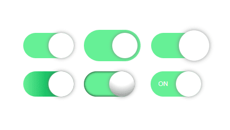
</label>Five Design Samples for Toggle switch
In the end, we will introduce five design samples for toggle switch.
All samples are based on the previous source code and can be created with the addition of classes and a bit of CSS.
Sample1: With edge
<!-- <label class="toggle"> --> <!-- removed -->
<label class="toggle -edge">    <!-- added -->
    <input type="checkbox">
    <div></div>
</label>
.toggle.-edge > div {
padding: 6px;
box-sizing: initial;
}See full source code
<style>
    .toggle > div {
        --width: 100px;
        width: var(--width);
        height: calc(var(--width) / 2);
        border-radius: calc(var(--width) / 2);
        background: gray;
        cursor: pointer;
        position: relative;
        display: inline-block;
    }
    .toggle > div::before {
        content: "";
        display: block;
        width: 50%;
        height: 100%;
        border-radius: 50%;
        background: #fff;
        transition: 0.5s;
        box-shadow: 0 0 8px gray;
    }
    .toggle [type=checkbox]:checked + div {
        background: lightgreen;
    }
    .toggle [type=checkbox]:checked + div:before {
        transform: translateX(100%);
    }
    .toggle [type=checkbox] {
        display: none;
    }

    .toggle.-edge > div {
        padding: 6px;
    }
</style>

<label class="toggle -edge">
    <input type="checkbox">
    <div></div>
</label>
Sample2: Big circle
<!-- <label class="toggle"> -->     <!-- removed -->
<label class="toggle -bigcircle">   <!-- added -->
    <input type="checkbox">
    <div></div>
</label>
.toggle.-bigcircle > div::before {
scale: 1.2;
}See full source cod
<style>
.toggle > div {
--width: 100px;
width: var(--width);
height: calc(var(--width) / 2);
border-radius: calc(var(--width) / 2);
background: gray;
cursor: pointer;
position: relative;
display: inline-block;
}
.toggle > div::before {
content: "";
display: block;
width: 50%;
height: 100%;
border-radius: 50%;
background: #fff;
transition: 0.5s;
box-shadow: 0 0 8px gray;
}
.toggle [type=checkbox]:checked + div {
background: lightgreen;
}
.toggle [type=checkbox]:checked + div:before {
transform: translateX(100%);
}
.toggle [type=checkbox] {
display: none;
}
.toggle.-bigcircle > div::before {
    scale: 1.2;
}
</style>
<label class="toggle -bigcircle">
<input type="checkbox">
<div></div>
</label>Sample3: Gradient
<!-- <label class="toggle"> -->     <!-- removed -->
<label class="toggle -gradient">    <!-- added -->
    <input type="checkbox">
    <div></div>
</label>
.toggle.-gradient [type=checkbox]:checked + div {
background: linear-gradient(to right, lightgreen, forestgreen 99%);
}See full source cod
<style>
.toggle > div {
--width: 100px;
width: var(--width);
height: calc(var(--width) / 2);
border-radius: calc(var(--width) / 2);
background: gray;
cursor: pointer;
position: relative;
display: inline-block;
}
.toggle > div::before {
content: "";
display: block;
width: 50%;
height: 100%;
border-radius: 50%;
background: #fff;
transition: 0.5s;
box-shadow: 0 0 8px gray;
}
.toggle [type=checkbox]:checked + div {
background: lightgreen;
}
.toggle [type=checkbox]:checked + div:before {
transform: translateX(100%);
}
.toggle [type=checkbox] {
display: none;
}
.toggle.-gradient [type=checkbox]:checked + div {
    background: linear-gradient(to right, lightgreen, forestgreen 99%);
}
</style>
<label class="toggle -gradient">
<input type="checkbox">
<div></div>
</label>Sample4: Three-Dimensional
<!-- <label class="toggle"> --> <!-- removed -->
<label class="toggle -threeD">  <!-- added -->
    <input type="checkbox">
    <div></div>
</label>
.toggle.-threeD > div {
box-shadow: 0px 0px 5px inset;
}
.toggle.-threeD > div::before {
background-image: radial-gradient(circle at top, white 50%, gray);
}See full source cod
<style>
    .toggle > div {
        --width: 100px;
        width: var(--width);
        height: calc(var(--width) / 2);
        border-radius: calc(var(--width) / 2);
        background: gray;
        cursor: pointer;
        position: relative;
        display: inline-block;
    }
    .toggle > div::before {
        content: "";
        display: block;
        width: 50%;
        height: 100%;
        border-radius: 50%;
        background: #fff;
        transition: 0.5s;
        box-shadow: 0 0 8px gray;
    }
    .toggle [type=checkbox]:checked + div {
        background: lightgreen;
    }
    .toggle [type=checkbox]:checked + div:before {
        transform: translateX(100%);
    }
    .toggle [type=checkbox] {
        display: none;
    }

    .toggle.-threeD > div {
        box-shadow: 0px 0px 5px inset;
    }
    .toggle.-threeD > div::before {
        background-image: radial-gradient(
            circle at top,
            white 50%,
            gray
        );
    }
</style>

<label class="toggle -threeD">
    <input type="checkbox">
    <div></div>
</label>
Sample5: With text
※By using custom properties, you can specify the content of the text on the HTML side.
<!-- <label class="toggle"> -->                                                 <!-- removed -->
<label class="toggle -withtext" style="--true-text:'ON'; --false-text:'OFF';">  <!-- added -->
    <input type="checkbox">
    <div></div>
</label>
.toggle.-withtext > div:after {
content: var(--false-text);
position: absolute;
right: 15%;
top: 50%;
transform: translateY(-50%);
color: #fff;
font-size: 13px;
}
.toggle.-withtext [type=checkbox]:checked + div:after {
content: var(--true-text);
left: 15%;
}See full source cod
<style>
.toggle > div {
--width: 100px;
width: var(--width);
height: calc(var(--width) / 2);
border-radius: calc(var(--width) / 2);
background: gray;
cursor: pointer;
position: relative;
display: inline-block;
}
.toggle > div::before {
content: "";
display: block;
width: 50%;
height: 100%;
border-radius: 50%;
background: #fff;
transition: 0.5s;
box-shadow: 0 0 8px gray;
}
.toggle [type=checkbox]:checked + div {
background: lightgreen;
}
.toggle [type=checkbox]:checked + div:before {
transform: translateX(100%);
}
.toggle [type=checkbox] {
display: none;
}
.toggle.-withtext > div:after {
    content: var(--false-text);
    position: absolute;
    right: 15%;
    top: 50%;
    transform: translateY(-50%);
    color: #fff;
    font-size: 13px;
}
.toggle.-withtext [type=checkbox]:checked + div:after {
    content: var(--true-text);
    left: 15%;
}
</style>
<label class="toggle -withtext" style="--true-text:'ON'; --false-text:'OFF';">
<input type="checkbox">
<div></div>
</label>That is all, it was about how to create a toggle switch and 5 sample designs