With the ::file-selector-button pseudo-element, it is no longer necessary to use JavaScript to modify the design of input type=”file”.
In this article, we will discuss how to modify the design of input type=”file” using only CSS.
We will also provide an explanation for changing button text, which can be a bit tricky.
Table of Contents
What the ::file-selector-button is
The ::file-selector-button is a pseudo-element that allows direct modification of the button design for the input type=”file”.
<style>
    .file-input::file-selector-button {
        color: blue;
    }
</style>
<input type="file" class="file-input">
Before this pseudo-element appear, it was necessary to modify the HTML structure and use JavaScript to style the input type=”file”. Now, that’s no longer necessary! Awesome.
Browser Compatibility of ::file-selector-button
The ::file-selector-button pseudo-element appears to be already supported in modern browsers.
Reference: ::file-selector-button” | Can I use…
Design Sample for input type=”file”
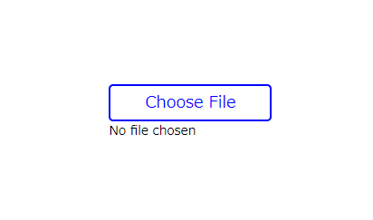
Of course, you can also change the border and background color using ::file-selector-button etc.
We’ll provide a sample code.
<style>
    .file-input::file-selector-button {
        border: 2px solid blue;
        color: blue;
        padding: 5px 10px;
        border-radius: 5px;
        font-size: 18px;
        display: block;
    }
</style>
<input type="file" class="file-input">
Line break between the button and text
To add line breaks, add display: block in the ::file-selector-button pseudo-element.
Specify the width to prevent invisible whitespace on the right side, which may occur in browsers like Chrome.
<style>
    .file-input {
        width: 160px;                   /* added */
    }
    .file-input::file-selector-button {
        border: 2px solid blue;
        color: blue;
        padding: 5px 10px;
        border-radius: 5px;
        font-size: 18px;
        width: 100%;                    /* added */
        display: block;                 /* added */
    }
</style>
<input type="file" class="file-input">
Specify the style for hover state
You can apply the :hover pseudo-class to the ::file-selector-button pseudo-element.
.file-input::file-selector-button:hover {
    background-color: blue;
    color: #fff;
}
The full text of source code
Here is the full source code up to this point.
※We also provide a method to change the text of input type=”file” at the very bottom, so if you’re interested, please take a look!
<style>
    .file-input {
        width: 160px;
    }
    .file-input::file-selector-button {
        border: 2px solid blue;
        color: blue;
        padding: 5px 10px;
        border-radius: 5px;
        font-size: 18px;
        width: 100%;
        display: block;
    }
    .file-input::file-selector-button:hover {
        background-color: blue;
        color: #fff;
    }
</style>

<input type="file" class="file-input">
Advanced: Changing the text of input type=”file”
One unfortunate limitation of the ::file-selector-button pseudo-element is that you cannot change the button text (As of December 11, 2023).
However, with some HTML and CSS ingenuity, there’s a way to achieve this.
<style>
    .file-input {
        display: inline-block;
        position: relative;
        width: 200px;
        --font-size: 18px;
        --padding: 5px 10px;
    }
    .file-input input[type=file]{
        width: 100%;
    }
    .file-input input[type=file]::file-selector-button {
        display: block;
        opacity: 0;
        margin-bottom: 5px;
        font-size: var(--font-size);
        padding: var(--padding);
    }
    .file-input::before {
        font-size: var(--font-size);
        padding: var(--padding);
        content: "Please Choose File";
        border-radius: 5px;
        background: #fff;
        border: 2px solid blue;
        color: blue;
        text-align: center;
        box-sizing: border-box;
        width: 100%;
        position: absolute;
    }
</style>

<label class="file-input">
    <input type="file">
</label>
That is all, it was about how to style input type=”file” using only CSS!

