In this article, we will explain how to create a hamburger menu using only HTML and CSS.
Table of Contents
- ⓪Completion Image of Hamburger Menu
- ①Prepare the components of the Hamburger Menu in HTML
- ②Create the Frame for the Hamburger Menu Button
- ③Create the Content for the Hamburger Menu Button.
- ④Make the Three Lines a Cross Mark when clicked
- ⑤The animation for opening and the appearance of the menu
- The full text of source code
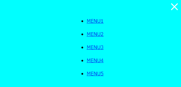
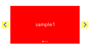
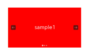
⓪Completion Image of Hamburger Menu
We aim to create a hamburger menu that the menu slides in from the side when clicked, using only HTML and CSS, as shown below.

①Prepare the components of the Hamburger Menu in HTML
Let’s leverage the power of the details & summary tags to implement the functionality of opening the menu on click.
<details class="hamburger-menu">
    <summary><span></span></summary>
    <div class="menu">
        <ul>
            <li><a href="javascript:void(0)">MENU1</a></li>
            <li><a href="javascript:void(0)">MENU2</a></li>
            <li><a href="javascript:void(0)">MENU3</a></li>
            <li><a href="javascript:void(0)">MENU4</a></li>
            <li><a href="javascript:void(0)">MENU5</a></li>
        </ul>
    </div>
</details>
The details and summary tags provide a mechanism to open content when clicked without the need for CSS or JS.
Try clicking the small triangle below, and the menu should open.
②Create the Frame for the Hamburger Menu Button
Let’s create the menu button using CSS.
We’ll hide the triangle of the summary tag and adjust the button’s size, position, and color.
※The value in the padding property on line 9 is stored in a custom property for later use.
.hamburger-menu summary {
    list-style: none;
}
.hamburger-menu summary::-webkit-details-marker {
    display: none;
}
.hamburger-menu summary {
    --btn-padding: 10px;
    padding: var(--btn-padding);
    width: 60px;
    height: 60px;
    padding: 10px;
    display: flex;
    flex-direction: column;
    justify-content: space-around;
    position: fixed;
    top: 0;
    right: 0;
    z-index: 99;
    background:aqua;
}
The frame for the menu button has been created.
③Create the Content for the Hamburger Menu Button.
We will create three white lines as the content of the menu button.
We have just made the parent element a Flex box to position the three lines evenly, so we only need to define the shape of the three lines.
.hamburger-menu summary span,
.hamburger-menu summary:before,
.hamburger-menu summary:after {
    content: "";
    width: 100%;
    height: 3px;
    background: #fff;
}
The content of the menu button has been created.
④Make the Three Lines a Cross Mark when clicked
The details tag has an open attribute when the content is opened.
We can define the button style for when the hamburger menu is opened.
.hamburger-menu[open] summary:before,
.hamburger-menu[open] summary:after {
    position: absolute;
    width: calc(100% - (var(--btn-padding) * 2));
}
.hamburger-menu[open] summary:before { rotate: -45deg; }
.hamburger-menu[open] summary:after { rotate: 45deg; }
.hamburger-menu[open] summary span { opacity: 0; }
The three lines should change to a cross mark, so please give it a try.
⑤The animation for opening and the appearance of the menu
Finally, let’s define the animation for when opening and the appearance of the menu to complete the hamburger menu.
.hamburger-menu[open] .menu {
    position: fixed;
    inset: 0;
    margin: auto;
    z-index: 98;
    background: aqua;
    animation: slideIn 1s ease;
}
.hamburger-menu[open] .menu ul{
    position: fixed;
    inset: 0;
    margin: auto;
    width: fit-content;
    height: fit-content;
}
.hamburger-menu[open] .menu ul li{
    margin: 20px 0;
}
@keyframes slideIn {
    from { transform: translateX(100%)}
    to { transform: translateX(0)}
}
The hamburger menu is now complete!
The following is not fixed for demo purposes, so the button may not be in the right position when opened, but don’t worry about it.
The full text of source code
In the end, we put the full source code.
<style>
    /* The Button of Hamburger Menu */
    .hamburger-menu summary {
        list-style: none;
    }
    .hamburger-menu summary::-webkit-details-marker {
        display: none;
    }
    .hamburger-menu summary {
        --btn-padding: 10px;
        padding: var(--btn-padding);
        width: 60px;
        height: 60px;
        padding: 10px;
        display: flex;
        flex-direction: column;
        justify-content: space-around;
        position: fixed;
        top: 0;
        right: 0;
        z-index: 99;
        background:aqua;
    }

    /* The Three Lines of the Hamburger Menu Button */
    .hamburger-menu summary span,
    .hamburger-menu summary:before,
    .hamburger-menu summary:after {
        content: "";
        width: 100%;
        height: 3px;
        background: #fff;
    }
    .hamburger-menu[open] summary:before,
    .hamburger-menu[open] summary:after {
        position: absolute;
        width: calc(100% - (var(--btn-padding) * 2));
    }
    .hamburger-menu[open] summary:before { rotate: -45deg; }
    .hamburger-menu[open] summary:after { rotate: 45deg; }
    .hamburger-menu[open] summary span { opacity: 0; }

    /* The Menu of Hamburger Menu */
    .hamburger-menu[open] .menu {
        position: fixed;
        inset: 0;
        margin: auto;
        z-index: 98;
        background: aqua;
        animation: slideIn 1s ease;
    }
    .hamburger-menu[open] .menu ul{
        position: fixed;
        inset: 0;
        margin: auto;
        width: fit-content;
        height: fit-content;
    }
    .hamburger-menu[open] .menu ul li{
        margin: 20px 0;
    }
    @keyframes slideIn {
        from { transform: translateX(100%)}
        to { transform: translateX(0)}
    }
</style>

<details class="hamburger-menu">
    <summary><span></span></summary>
    <div class="menu">
        <ul>
            <li><a href="javascript:void(0)">MENU1</a></li>
            <li><a href="javascript:void(0)">MENU2</a></li>
            <li><a href="javascript:void(0)">MENU3</a></li>
            <li><a href="javascript:void(0)">MENU4</a></li>
            <li><a href="javascript:void(0)">MENU5</a></li>
        </ul>
    </div>
</details>
That is all, it was about how to create a hamburger menu using only HTML and CSS.
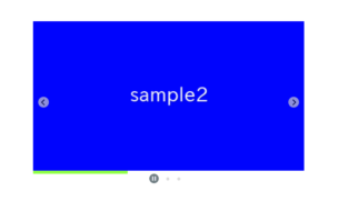
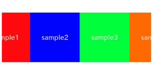
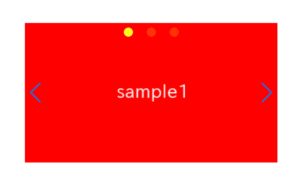
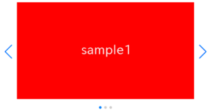
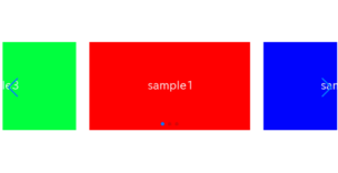
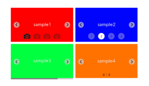
There are other things that can be achieved using only CSS, such as the following.
