We’ve explored various methods for creating a modal box using only HTML and CSS, so we’ll share our thoughts and notes after trying it out.
Table of Contents
Can we create a Modal Box using only HTML and CSS?
Let me get straight to the point, modal box can be created using only HTML and CSS.
However, we found that no matter how hard we tried, we had to sacrifice maintainability or usability.
We will describe each method and its characteristics
:target pseudo-class (Recommendation Level : ★☆☆)
:target is a pseudo-class that represents an element with the same ID as the fragment identifier (denoted by #) in the URL.
For example, when the URL is https://samplehoge.com/#modal, you can apply CSS to the element with id=’modal’ using the :target pseudo-class.
This mechanism can be used to create a modal box.
However, we can’t recommend this in terms of both maintainability and usability.
Demerit
・If do browser back after opening and closing the modal, the modal reopen coz histories are kept
・When placing multiple modals, you need to change the id and the href attribute
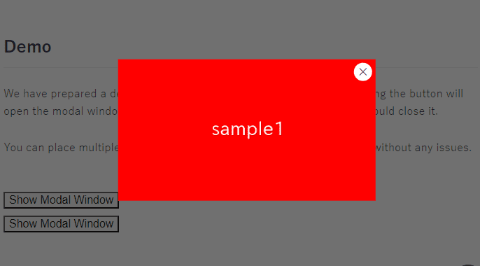
Demo
Source Code
<style>
    .modal .content:not(:target),
    .modal .content:not(:target) + .bg {
        display: none;
    }
    .modal a {
        appearance: none;
        color:inherit;
        text-decoration: none;
    }
    .modal .content {
        position: fixed;
        inset: 0;
        margin: auto;
        width: fit-content;
        height: fit-content;
        background: #fff;
        padding: 10px;
        border: 2px solid;
        z-index: 99;
    }
    .modal .content + .bg {
        position: fixed;
        inset: 0;
        background: #1119;
        z-index: 98;
    }
    .modal .content .close-btn {
        position: absolute;
        top: 10px;
        right: 10px;
        line-height: 0.6;
        font-size: 36px;
    }
</style>
<div class="modal">
    <a href="#modal1">Open the Modal Box</a>
    <div id="modal1" class="content">
        <a href="#!" class="close-btn">×</a>
        <img src="./img/sample.png">
        <input type="text">
    </div>
    <a href="#!" class="bg"></a>
</div>
Checkbox & Labels (Recommendation Level : ★☆☆)
This method uses the adjacent sibling selector to display only the content next to the checkbox that is turned on.
While there are no usability issues, it is not highly recommended for maintainability due to the large number of labels associated with checkboxes.
Demerit
・When you put multiple modals, you have to rewrite the id and for attribute(three times) of the label
Demo
Source Code
<style>
    .modal-check,
    .modal-check:not(:checked) + .modal {
        display: none;
    }
    .modal {
        position: relative;
        z-index: 99;
    }
    .modal .bg {
        position: fixed;
        inset: 0;
        background: #1119;
    }
    .modal .content {
        position: fixed;
        margin: auto;
        inset: 0;
        width: fit-content;
        height: fit-content;
        background: #fff;
        padding: 10px;
        border: 2px solid;
    }
    .modal .content .close-btn {
        position: absolute;
        top: 10px;
        right: 10px;
        line-height: 0.6;
        font-size: 36px;
    }
</style>

<label for="modal1">Open the Modal Box</label>
<input id="modal1" type="checkbox" class="modal-check">
<div class="modal">
    <label for="modal1" class="bg"></label>
    <div class="content">
        <label for="modal1" class="close-btn">×</label>
        <img src="./img/sample.png">
        <input type="text">
    </div>
</div>
details & summary (Recommendation Level : ★★☆)
details & summary element come with the default functionality to open content on button click, so you can also use this to create a modal box.
While there are the following two drawbacks, they might be barely acceptable.
Demerit
・Button disappears when modal is opened
・The close button can only be positioned absolute to the content
Demo
Click Here To Open the Modal Box
Source Code
<style>
    .modal[open] {
        position: fixed;
        inset: 0;
        margin: auto;
        width: fit-content;
        height: fit-content;
    }
    .modal[open] summary:before{
        content: "";
        position: fixed;
        inset: 0;
        background: #1119;
        z-index: 98;
    }
    .modal[open] summary:after{
        content: attr(data-close-text);
        position: absolute;
        top: 10px;
        right: 10px;
        line-height: 0.6;
        font-size: 36px;
        z-index: 100;
    }
    .modal[open] .trigger,
    .modal summary::-webkit-details-marker {
        display: none;
    }
    .modal summary {
        list-style-type: none;
        display: inline-block;
    }
    .modal .content {
        background: #fff;
        padding: 10px;
        border: 2px solid;
        position: relative;
        z-index: 99;
    }
</style>

<details class="modal">
    <summary data-close-text="×">
        <div class="trigger">Open the Modal Box</div>
    </summary>
    <div class="content">
        <img src="./img/sample.png">
        <input type="text">
    </div>
</details>
Complete Modal Box (Recommendation Level : ★★★)
As we’ve seen, it’s indeed possible to create a modal box using only HTML and CSS.
However, for building a modal box without sacrificing both usability and maintainability, it is still better to use Javascript.
Currently, there is a dialog element that allows creating a modal box with minimal JavaScript.
Please refer the below article on how to create a modal box with a little Javascript (only 4 lines).
[Javascript] How to Create a Modal Box
That is all, it was about whether a modal box can be created using only HTML and CSS!
