Swiper.js is originally a JavaScript library for creating sliders, but it can also be used to implement tab switching menus.
In this article, we will explain how to do that.
We are going to pursue the matter on the premise that you know how to make normal slider with Swiper.js. So if you are new to Swiper.js, firstly check the below article.
[Swiper] How to create a simple slider with swiper.js
Table of Contents
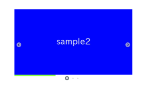
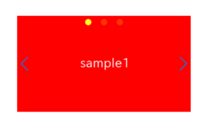
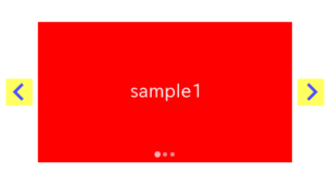
①Create a slider with pagination
First, let’s use Swiper.js to create a slider with pagination.
We will use pagination as the switching buttons for the tab menu, so place it above .swiper-wrapper in the HTML.
Also, don’t forget to include clickable: true so that you can switch the tab content by clicking.
<link rel="stylesheet" href="https://cdn.jsdelivr.net/npm/swiper@8/swiper-bundle.min.css">
<script src="https://cdn.jsdelivr.net/npm/swiper@8/swiper-bundle.min.js"></script>

<style>
    .sample-slider {
        width:70%;
    }
    .sample-slider img {
        width: 100%;
    }
</style>

<div class="swiper sample-slider">
    <div class="swiper-pagination"></div>   <!-- Don't forget to place pagination above the slider -->
    <div class="swiper-wrapper">
        <div class="swiper-slide"><img src="./img/sample1.png"></div>
        <div class="swiper-slide"><img src="./img/sample2.png"></div>
        <div class="swiper-slide"><img src="./img/sample3.png"></div>
    </div>
</div>

<script>
    const swiper = new Swiper('.sample-slider', {
        pagination: {
            el: '.swiper-pagination',
            clickable: true,
        },
    })
</script>
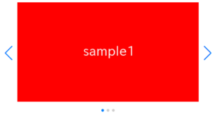
You have created a slider with pagination (dots).
If you click the pagination button, the tab content will switch.


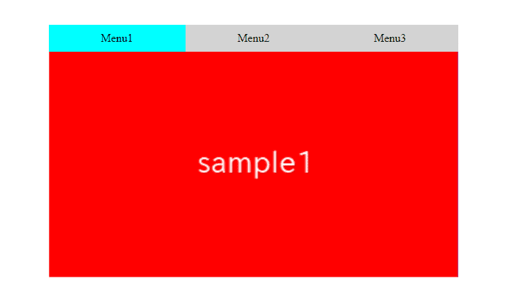
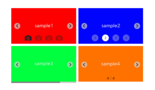
②Make the pagination look like buttons for the tab menu
Let’s make the pagination look more like tab menu switching buttons using CSS.
.sample-slider .swiper-pagination {
    position: static;
    display: grid;
    grid-template-columns: repeat(3,1fr);
}
.sample-slider .swiper-pagination-bullet {
    width: 100%;
    border-radius: 0;
    height: auto;
    margin: 0!important;
    padding: 10px;
    box-sizing: border-box;
    opacity: initial;
    background: lightgrey;
}
.sample-slider .swiper-pagination-bullet-active {
    background: aqua;
}
The pagination now looks more like tab menu switching buttons.
Next, let’s add text to the buttons.
③Add text to the tab menu buttons.
In Swiper.js, you can use the renderBullet option to change the content of the pagination buttons.
Let’s use this to add text to the buttons of the tab menu.
const swiper = new Swiper('.sample-slider', {
    pagination: {
        el: '.swiper-pagination',
        clickable: true,
        /*----------- ↓ added ↓ ------------*/
        renderBullet: function (i, classes) {
            const buttons = ['Menu1', 'Menu2', 'Menu3']
            return `<span class="${classes}">${buttons[i]}</span>`
        },
        /*----------- ↑ added ↑ ------------*/
    },
})
Text has been added to the buttons of the tab menu.
④Change the switching animation
The current switching animation is set to ‘slide’.
Finally, let’s look at how to change this switching animation.
Switch instantly (no animation).
By adding the option speed: 0, the tab content will switch instantly.
const swiper = new Swiper('.sample-slider', {
    .
    .
    .
    speed: 0,
})
Switching smoothly (fade effect)
By adding effect: ‘fade’ and specifying the speed, the tab content will swhitch smoothly, with a fading effect.
const swiper = new Swiper('.sample-slider', {
    .
    .
    .
    speed: 1000,
    effect: 'fade',
})
The full text of source code
In the end, we put the full text of source code.
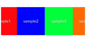
※This time, we used images for the tab content, but of course, you can use other than images as well.
<link rel="stylesheet" href="https://cdn.jsdelivr.net/npm/swiper@8/swiper-bundle.min.css">
<script src="https://cdn.jsdelivr.net/npm/swiper@8/swiper-bundle.min.js"></script>

<style>
    .sample-slider {
        width:70%;
    }
    .sample-slider img {
        width: 100%;
    }
    .sample-slider .swiper-pagination {
        position: static;
        display: grid;
        grid-template-columns: repeat(3, 1fr);
    }
    .sample-slider .swiper-pagination-bullet {
        width: 100%;
        border-radius: 0;
        height: auto;
        margin: 0!important;
        padding: 10px;
        box-sizing: border-box;
        opacity: initial;
        background: lightgrey;
    }
    .sample-slider .swiper-pagination-bullet-active {
        background: aqua;
    }
</style>


<div class="swiper sample-slider">
    <div class="swiper-pagination"></div>
    <div class="swiper-wrapper">
        <div class="swiper-slide"><img src="./img/sample1.png"></div>
        <div class="swiper-slide"><img src="./img/sample2.png"></div>
        <div class="swiper-slide"><img src="./img/sample3.png"></div>
    </div>
</div>


<script>
    const swiper = new Swiper('.sample-slider', {
        pagination: {
            el: '.swiper-pagination',
            clickable: true,
            renderBullet: function (i, classes) {
                const buttons = ['Menu1', 'Menu2', 'Menu3']
                return `<span class="${classes}">${buttons[i]}</span>`
            },
        },
        speed: 0,
    })
</script>
That’s all, it was about how to create tabs with Swiper.js.
