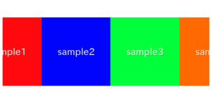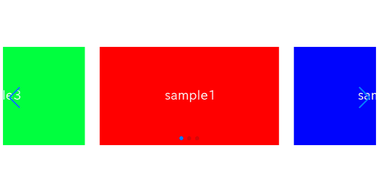
In this article, I am going to describe about how to show parts of both sides of swiper slider.
It is feasible by only add swiper option.
I’m going to pursue the matter on the premise that you know how to make normal slider with Swiper.js. So if you are new to Swiper.js, firstly check the below article.
[Swiper] How to create a simple slider with swiper.js
Table of Contents
①Create a normal swiper slider
To make it clear, we will create normal swiper slider first and then make changes.
<link rel="stylesheet" href="https://cdn.jsdelivr.net/npm/swiper@8/swiper-bundle.min.css">
<script src="https://cdn.jsdelivr.net/npm/swiper@8/swiper-bundle.min.js"></script>

<style>
    .sample-slider{
        width:70%;
    }
    .sample-slider img{
        width: 100%;
    }
</style>

<div class="swiper sample-slider">
    <div class="swiper-wrapper">
        <div class="swiper-slide"><img src="img/sample1.png"></div>
        <div class="swiper-slide"><img src="img/sample2.png"></div>
        <div class="swiper-slide"><img src="img/sample3.png"></div>
    </div>
    <div class="swiper-pagination"></div>
    <div class="swiper-button-prev"></div>
    <div class="swiper-button-next"></div>
</div>

<script>
    const swiper = new Swiper('.sample-slider', {
        loop: true,                         //loop
        autoplay: {                         //autoplay
            delay: 2000,
        },
        pagination: {                       //pagination(dots)
            el: '.swiper-pagination',
        },
        navigation: {                       //navigation(arrows)
            nextEl: ".swiper-button-next",
            prevEl: ".swiper-button-prev",
        },
    })
</script>
Now we can see a normal slider.
②Specify number of slides to show
You can change number of slides to show by slidesPerView option.
Here, lets try to show 2 slides.
Add 1 row as below to swiper option.
const swiper = new Swiper('.sample-slider', {
    loop: true,
    slidesPerView: 2,                   //added
    autoplay: {
        delay: 2000,
    },
    pagination: {
        el: '.swiper-pagination',
    },
    navigation: {
        nextEl: ".swiper-button-next",
        prevEl: ".swiper-button-prev",
    },
})
Now 2 slides has been shown.
③Put acctive slide at center
By setting centeredSlides option true, acctive slide will come center.
const swiper = new Swiper('.sample-slider', {
    loop: true,
    slidesPerView: 2,
    centeredSlides : true,              //added
    autoplay: {
        delay: 2000,
    },
    pagination: {
        el: '.swiper-pagination',
    },
    navigation: {
        nextEl: ".swiper-button-next",
        prevEl: ".swiper-button-prev",
    },
})
Now acctive slide has came center.
④Adjust space between slides
In the end, Lets adjust space between slides.
It is feasible by adding spaceBetween option.
const swiper = new Swiper('.sample-slider', {
    loop: true,
    slidesPerView: 2,
    centeredSlides : true,
    spaceBetween: 20,               //added
    autoplay: {
        delay: 2000,
    },
    pagination: {
        el: '.swiper-pagination',
    },
    navigation: {
        nextEl: ".swiper-button-next",
        prevEl: ".swiper-button-prev",
    },
})
Now it looks good!
By changing value of slidesPerView, you can change shown area of both sides.
The full text of sorce code
In the end, I put the full text of source code.
<link rel="stylesheet" href="https://cdn.jsdelivr.net/npm/swiper@8/swiper-bundle.min.css">
<script src="https://cdn.jsdelivr.net/npm/swiper@8/swiper-bundle.min.js"></script>

<style>
    .sample-slider{
        width:70%;
    }
    .sample-slider img{
        width: 100%;
    }
</style>

<div class="swiper sample-slider">
    <div class="swiper-wrapper">
        <div class="swiper-slide"><img src="img/sample1.png"></div>
        <div class="swiper-slide"><img src="img/sample2.png"></div>
        <div class="swiper-slide"><img src="img/sample3.png"></div>
    </div>
    <div class="swiper-pagination"></div>
    <div class="swiper-button-prev"></div>
    <div class="swiper-button-next"></div>
</div>

<script>
    const swiper = new Swiper('.sample-slider', {
        loop: true,                         //loop
        slidesPerView: 2,                   //number of slides to show
        centeredSlides : true,              //put acctive slide center
        spaceBetween: 20,                   //space between slides
        autoplay: {                         //autoplay
            delay: 2000,
        },
        pagination: {                       //pagination(dots)
            el: '.swiper-pagination',
        },
        navigation: {                       //navigation(arrows)
            nextEl: ".swiper-button-next",
            prevEl: ".swiper-button-prev",
        },
    })
</script>
Thats all, it was about how to show parts of both sides of swiper slider.
I have been introduced various slider which can be made by swiper.js.
Swiper Demo 22 Slider

