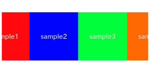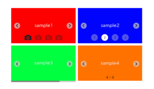
When we create swiper slider, sometimes want to change size, position or color of arrows.
I will show how to do it with the demos.
I’m going to pursue the matter on the premise that you know how to make normal slider with Swiper.js. So if you are new to Swiper.js, firstly check the below article.
[Swiper] How to create a simple slider with swiper.js
Table of Contents
Create a normal swiper slider
To make it clear, we will create a normal swiper slider first and then make changes.
<link rel="stylesheet" href="https://cdn.jsdelivr.net/npm/swiper@8/swiper-bundle.min.css">
<script src="https://cdn.jsdelivr.net/npm/swiper@8/swiper-bundle.min.js"></script>

<style>
    .sample-slider{
        width:70%;
    }
    .sample-slider img{
        width: 100%;
    }
</style>

<div class="swiper sample-slider">
    <div class="swiper-wrapper">
        <div class="swiper-slide"><img src="img/sample1.png"></div>
        <div class="swiper-slide"><img src="img/sample2.png"></div>
        <div class="swiper-slide"><img src="img/sample3.png"></div>
    </div>
    <div class="swiper-pagination"></div>
    <div class="swiper-button-prev"></div>
    <div class="swiper-button-next"></div>
</div>

<script>
    const swiper = new Swiper('.sample-slider', {
        loop: true,                         //loop
        autoplay: {                         //autoplay
            delay: 2000,
        },
        pagination: {                       //pagination(dots)
            el: '.swiper-pagination',
        },
        navigation: {                       //navigation(arrows)
            nextEl: ".swiper-button-next",
            prevEl: ".swiper-button-prev",
        },
    })
</script>
Now we can see a normal swiper slider.
How to change the arrows size
We can specify the arrows size by ::after pseudo-elements of swiper-button-next class and swiper-button-prev class.
The default is font-size:44px. So if you specify it 30px, the arrows will smaller.
.sample-slider [class^="swiper-button-"]::after{
    font-size: 30px;
}
How to change the arrows position
We can change the arrows position by swiper-button-next class and swiper-button-prev class.
The modification method depends on ‘where we want to put the arrows‘, so I will describe one by one.
Move the arrows in the central direction
We can move the arrows in the central direction by specifying width property.
Default is 27px. So if you specify it 100px as below, arrows will move in the central direction .
.sample-slider [class^="swiper-button-"]{
    width: 100px;
}
Move the arrows in the outward direction
We can move the arrows in the outward direction by setting numbers under 27px at width property.
.sample-slider [class^="swiper-button-"]{
    width: 5px;
}
Put the arrows outside the frame
If we try to put arrows outside the frame by right property or left property, the stray part will not be displayed.
We can put the arrows outside the frame by writing as below.
.sample-slider img{
    width: 80%;
    display: block;
    margin: 0 auto;
}
Move the arrows up
We can move the arrows up by specifying top property.
.sample-slider [class^="swiper-button-"]{
    top: 20px;
}
Move the arrows down
We can move the arrows down by initializing top property and specifying bottom property.
.sample-slider [class^="swiper-button-"]{
    top: initial;
    bottom: 0;
}
How to change the arrows color
We can change the arrows color by specifying color property at swiper-button-next class and swiper-button-prev class.
.sample-slider [class^="swiper-button-"]{
   color: yellow;
}
That is all, it was how to change size, position and color of arrows.
If you want to change the size, position, or color of the pafination, you may find the following article helpful.
[Swiper]How to change size, position and color of pagination
If you want to know how to replace the arrows with any images, below article might be helpful
[Swiper]How to customize arrows of Swiper slider


