In this article, we will explain how to create an accordion menu using only HTML and CSS.
Table of Contents
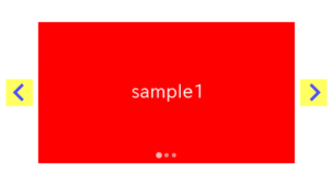
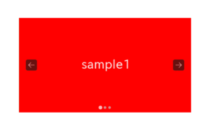
⓪Completion Image of Accordion Menu
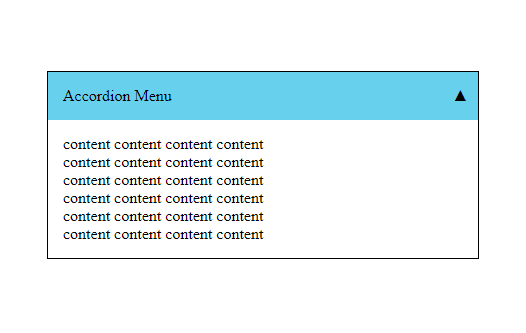
We aim to implement an accordion menu that slowly opens on click, using HTML and CSS, as shown below.
①Prepare the parts of the Accordion Menu in HTML
Let’s use the power of the details & summary tags to implement the functionality of opening the content on click.
<details class="accordion">
    <summary>Accordion Button</summary>
    <div class="content">
        content content content content<br>
        content content content content<br>
        content content content content<br>
        content content content content<br>
    </div>
</details>
The details and summary tags provide a mechanism to open content when clicked without the need for CSS or JS.
The content should open when clicked the below button, so please give it a try.
Accordion Button
content content content content
content content content content
content content content content
②Define the Style of the Accordion Menu
Let’s add a background color and border to the accordion menu.
.accordion {
    border: 1px solid #000;
}
.accordion summary {
    padding: 15px;
    cursor: pointer;
    background: skyblue;
    position: relative;
    list-style: none;
}
Accordion Button
content content content content
content content content content
content content content content
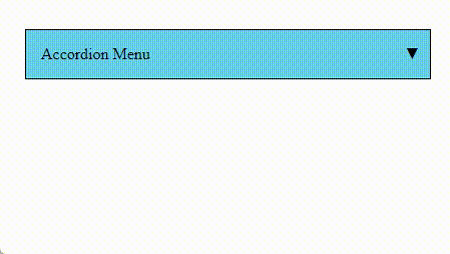
③Indicator for the Open/Close state of the Accordion Menu
To hide the default triangle marker which indicate open/close state, perform the following two steps.
・Apply list-style: none to the summary element.
・Apply display: none to summary::-webkit-details-marker (for Safari).
.accordion summary {
    padding: 15px;
    cursor: pointer;
    background: skyblue;
    position: relative;
    list-style: none;   /* added */
}

/********** ↓ added ↓ **********/
.accordion summary::-webkit-details-marker {
    display: none;
}
/********** ↑ added ↑ *********/
Let’s display the indicator for the open/close state at the right end of the button.
.accordion summary::after {
    content: '▼';
    position: absolute;
    right: 10px;
    top: 50%;
    transform: translateY(-50%);
}
.accordion[open] summary::after {
    content: '▲';
}
Accordion Button
content content content content
content content content content
content content content content
④Add Open/Close Animation to the Accordion Menu
The details tag has the open attribute when opened, so we utilize this to execute the @keyframes animation.
.accordion .content {
    --padding-y: 15px;
    --padding-x: 15px;
    padding: 0 var(--padding-x);
}
.accordion[open] .content {
    animation: fadeIn 1s ease forwards;
}
@keyframes fadeIn {
    100% { padding: var(--padding-y) var(--padding-x) }
}However, since the content height is variable, fixing the height is not appropriate.
Instead, we mimic the effect by adjusting the top and bottom padding from 0 to a fixed value.
The open/close animation should has been applied, so please check it.
※ When using the details & summary tags, the animation may not work properly from the second time onward.
Accordion Button
content content content content
content content content content
content content content content
While it is possible to create a somewhat simulated open/close animation for the accordion menu using only HTML and CSS, achieving perfection seems challenging.
If you want to create a robust animation, it appears that using JavaScript is still the preferable option.
[Javascript] An Accordion Menu with Minimal Code
The full text of source code
In the end, we put the full text of source code.
<style>
    .accordion {
        border: 1px solid #000;
    }
    .accordion summary {
        padding: 15px;
        cursor: pointer;
        background: skyblue;
        position: relative;
        list-style: none;
    }
    .accordion summary::-webkit-details-marker {
        display: none;
    }
    .accordion summary::after {
        content: '▼';
        position: absolute;
        right: 10px;
        top: 50%;
        transform: translateY(-50%);
    }
    .accordion[open] summary::after {
        content: '▲';
    }
    .accordion .content {
        --padding-y: 15px;
        --padding-x: 15px;
        padding: 0 var(--padding-x);
    }
    .accordion[open] .content {
        animation: fadeIn 1s ease forwards;
    }
    @keyframes fadeIn {
        100% { padding: var(--padding-y) var(--padding-x) }
    }
</style>

<details class="accordion">
    <summary>Accordion Button</summary>
    <div class="content">
        content content content content<br>
        content content content content<br>
        content content content content<br>
        content content content content<br>
    </div>
</details>
There are other things that can be achieved using only CSS, such as the following.
That is all, it was about how to create an accordion menu using only HTML and CSS!
