There are times when you might want to place the navigation arrows and pagination dots of a slider created using Swiper and React outside of the slider itself.
In this article, we will explain how to achieve this with the help of demos.
Table of Contents
①Create a normal swiper slider
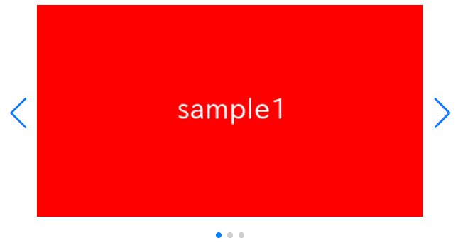
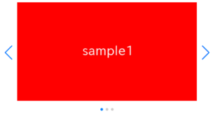
For clarity, let’s start by creating a normal Swiper slider in React, and then we’ll make modifications from there.
npm i swiper@8import { Swiper, SwiperSlide } from 'swiper/react'
import { Navigation, Pagination, Autoplay} from 'swiper'
import 'swiper/css/navigation'
import 'swiper/css/pagination'
import 'swiper/css'
import './style.css'
export default function SampleSlider() {
return (
<Swiper
className="sample-slider"
modules={[Navigation, Pagination, Autoplay]}
navigation
pagination
loop={true}
autoplay={{ delay:2000 }}
>
<SwiperSlide><img src="/img/sample1.png" /></SwiperSlide>
<SwiperSlide><img src="/img/sample2.png" /></SwiperSlide>
<SwiperSlide><img src="/img/sample3.png" /></SwiperSlide>
</Swiper>
)
}.sample-slider {
width: 70%;
}
.sample-slider img {
width: 100%;
}
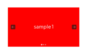
Now we can see a normal swiper slider.


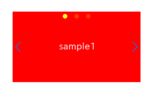
②Move the arrows and dots outside using only CSS
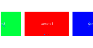
While the code may be a bit lengthy, it’s possible to move the arrows and dots outside using only CSS. The concept is to define the position of arrows and dots using the grid property instead of the position property.
Since the arrows and dots still have ‘position: absolute‘, they are exempt from ‘overflow: hidden‘ and can be displayed overflowing.
.sample-slider {
  position: static!important;
  display: grid!important;
}
.sample-slider [class^="swiper-button-"]{
  inset: initial;
  margin: 0;
  align-self: center;
}
.sample-slider .swiper-button-prev{
  justify-self: start;
  margin-left: -40px;
}
.sample-slider .swiper-button-next{
  justify-self: end;
  margin-right: -40px;
}
.sample-slider .swiper-pagination{
  inset: initial!important;
  align-self: end;
  justify-self: center;
  margin-bottom: -40px;
}
Now arrows and dots has been placed outside of slider.
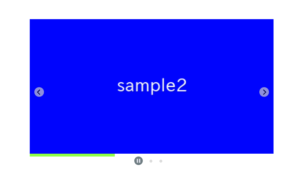
③If you want to move only the dots outside, it’s simple
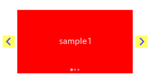
Just as a side note, if you want to move only the dots outside, it’s very simple.
You can achieve it by simply adding padding to the top and bottom, like this.
.sample-slider {
    padding: 40px 0!important;
}
The full text of source code
In the end, I put the full text of source code.
npm i swiper@8import { Swiper, SwiperSlide } from 'swiper/react'
import { Navigation, Pagination, Autoplay} from 'swiper'
import 'swiper/css/navigation'
import 'swiper/css/pagination'
import 'swiper/css'
import './style.css'
export default function SampleSlider() {
return (
<Swiper
className="sample-slider"
modules={[Navigation, Pagination, Autoplay]}
navigation
pagination
loop={true}
autoplay={{ delay:2000 }}
>
<SwiperSlide><img src="/img/sample1.png" /></SwiperSlide>
<SwiperSlide><img src="/img/sample2.png" /></SwiperSlide>
<SwiperSlide><img src="/img/sample3.png" /></SwiperSlide>
</Swiper>
)
}.sample-slider {
width: 70%;
position: static!important;
display: grid!important;
}
.sample-slider [class^="swiper-button-"]{
inset: initial;
margin: 0;
align-self: center;
}
.sample-slider .swiper-button-prev{
justify-self: start;
margin-left: -40px;
}
.sample-slider .swiper-button-next{
justify-self: end;
margin-right: -40px;
}
.sample-slider .swiper-pagination{
inset: initial!important;
align-self: end;
justify-self: center;
margin-bottom: -40px;
}
.sample-slider img {
width: 100%;
}
That is all, it was about how to put arrows and dots outside of slider.
