In this article, I am going to describe about how to create coverflow slider such as the eyecatch of this article using effect option of swiper.js.
I will also explain how to make detailed adjustments using coverflowEffect.
I’m going to pursue the matter on the premise that you know how to make normal slider with Swiper.js. So if you are new to Swiper.js, firstly check the below article.
[Swiper] How to create a simple slider with swiper.js
Table of Contents
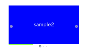
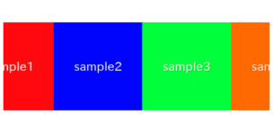
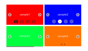
①Create a normal swiper slider
To make it clear, we will create normal swiper slider first and then make changes.
<link rel="stylesheet" href="https://cdn.jsdelivr.net/npm/swiper@8/swiper-bundle.min.css">
<script src="https://cdn.jsdelivr.net/npm/swiper@8/swiper-bundle.min.js"></script>

<style>
    .sample-slider{
        width:70%;
    }
    .sample-slider img{
        width: 100%;
    }
</style>

<div class="swiper sample-slider">
    <div class="swiper-wrapper">
        <div class="swiper-slide"><img src="./img/sample1.png"></div>
        <div class="swiper-slide"><img src="./img/sample2.png"></div>
        <div class="swiper-slide"><img src="./img/sample3.png"></div>
        <div class="swiper-slide"><img src="./img/sample4.png"></div>
    </div>
    <div class="swiper-pagination"></div>
    <div class="swiper-button-prev"></div>
    <div class="swiper-button-next"></div>
</div>

<script>
    const swiper = new Swiper('.sample-slider', {
        loop: true,                         //loop
        pagination: {                       //pagination(dots)
            el: '.swiper-pagination',
        },
        navigation: {                       //navigation(arrows)
            nextEl: ".swiper-button-next",
            prevEl: ".swiper-button-prev",
        },
    })
</script>
Now we can see normal slider.


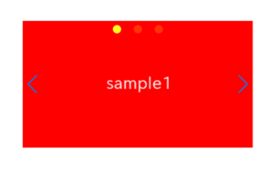
②Change the number of shown items
We can hange the number of shown items by slidesPerView option.
Let’s do centering the first slide by centeredSlides option as well.
const swiper = new Swiper('.sample-slider', {
loop: true,
slidesPerView: 3, //add(how many slides to show)
centeredSlides: true, //add(centering the first slide)
pagination: {
el: '.swiper-pagination',
},
navigation: {
nextEl: ".swiper-button-next",
prevEl: ".swiper-button-prev",
},
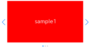
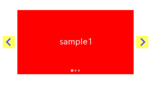
})③Apply the coverflow effect
We can apply the coverflow effect by adding effect: “coverflow” to the swiper ooption as below.
const swiper = new Swiper('.sample-slider', {
    loop: true,
    slidesPerView: 3,
    centeredSlides: true,
    effect: "coverflow",    //add(applying the coverflow effect)
    pagination: {
        el: '.swiper-pagination',
    },
    navigation: {
        nextEl: ".swiper-button-next",
        prevEl: ".swiper-button-prev",
    },
})
The coverflow slider has been completed!
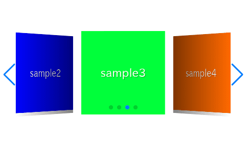
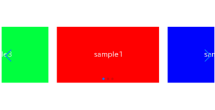
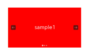
④Fine adjustments by the coverflowEffect option
When specifying effect: “coverflow”, you can make fine adjustments using the coverflowEffect option.
The available options that can be specified with coverflowEffect are as follows:
| option | type | default | description |
|---|---|---|---|
| rotate | number | 50 | Rotate of the prev and next slides |
| depth | number | 100 | Depth of the prev and next slides |
| stretch | number | 0 | Space between the slides |
| modifier | number | 1 | Multiply the values of rotate, depth, and stretch |
| scale | number | 1 | Size ratio of the prev and next slides |
| slideShadows | boolean | true | Presence of shadow on the surfaces of the prev and next slides |
Let’s take a look at an example using the coverflowEffect option.
const swiper = new Swiper('.sample-slider', {
    loop: true,
    slidesPerView: 3,
    centeredSlides: true,
    effect: "coverflow",
    coverflowEffect: {          // added
        rotate: 0,              // added (Rotate of the prev and next slides)
        depth: 200,             // added (Depth of the prev and next slides)
        stretch: 30,            // added (Space between the slides)
        modifier: 1,            // added (Multiply the values of rotate, depth, and stretch)
        scale: 1,               // added (Size ratio of the prev and next slides)
        slideShadows: false,    // added (Presence of shadow on the surfaces of the prev and next slides)
    },                          // added
    pagination: {
        el: '.swiper-pagination',
    },
    navigation: {
        nextEl: ".swiper-button-next",
        prevEl: ".swiper-button-prev",
    },
})
We are eliminating the rotation, increasing the depth, and reducing the space between the slides. (When specifying a value smaller than the slide’s width for the ‘stretch’ option, the space between the slides shrinks.
The full text of source code
In the end, I put the full text of source code.
<link rel="stylesheet" href="https://cdn.jsdelivr.net/npm/swiper@8/swiper-bundle.min.css">
<script src="https://cdn.jsdelivr.net/npm/swiper@8/swiper-bundle.min.js"></script>

<style>
    .sample-slider{
        width:70%;
    }
    .sample-slider img{
        width: 100%;
    }
</style>

<div class="swiper sample-slider">
    <div class="swiper-wrapper">
        <div class="swiper-slide"><img src="./img/sample1.png"></div>
        <div class="swiper-slide"><img src="./img/sample2.png"></div>
        <div class="swiper-slide"><img src="./img/sample3.png"></div>
        <div class="swiper-slide"><img src="./img/sample4.png"></div>
    </div>
    <div class="swiper-pagination"></div>
    <div class="swiper-button-prev"></div>
    <div class="swiper-button-next"></div>
</div>

<script>
    const swiper = new Swiper('.sample-slider', {
        loop: true,                         // loop
        slidesPerView: 3,                   // how many slides to show
        centeredSlides: true,               // centering the first slide
        effect: "coverflow",                // applying the coverflow effect
        coverflowEffect: {
            rotate: 0,                      // Rotate of the prev and next slides
            depth: 200,                     // Depth of the prev and next slides
            stretch: 30,                    // Space between the slides
            modifier: 1,                    // Multiply the values of rotate, depth, and stretc
            scale: 1,                       // Size ratio of the prev and next slides
            slideShadows: false,            // Presence of shadow on the surfaces of the prev and next slides
        },
        pagination: {                       // pagination(dots)
            el: '.swiper-pagination',
        },
        navigation: {                       // navigation(arrows)
            nextEl: ".swiper-button-next",
            prevEl: ".swiper-button-prev",
        },
    })
</script>
That is all, it was about how to create coverflow slider by swiper.js.
There are the other sliders which can be made by effect option.
[Swiper]How to create cube slider
[Swiper]How to create card slider
[Swiper]How to create flip slider
[Swiper]How to create fade slider
[Swiper]How to create original slider using creativeEffect
If you are interested in how various slider can be made by swiper.js, please refer below article!
Swiper Demo 22 Slider
